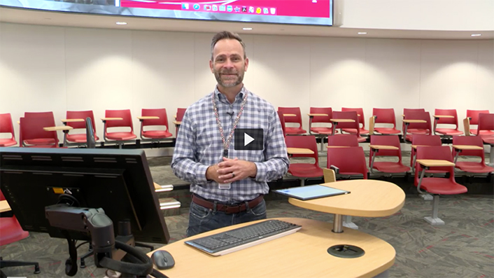
Designed to promote learning, collaboration, and flexibility, Indiana University's new Collaborative Theatre combines inspiration from historical amphitheater design and modern creative-space design typology.
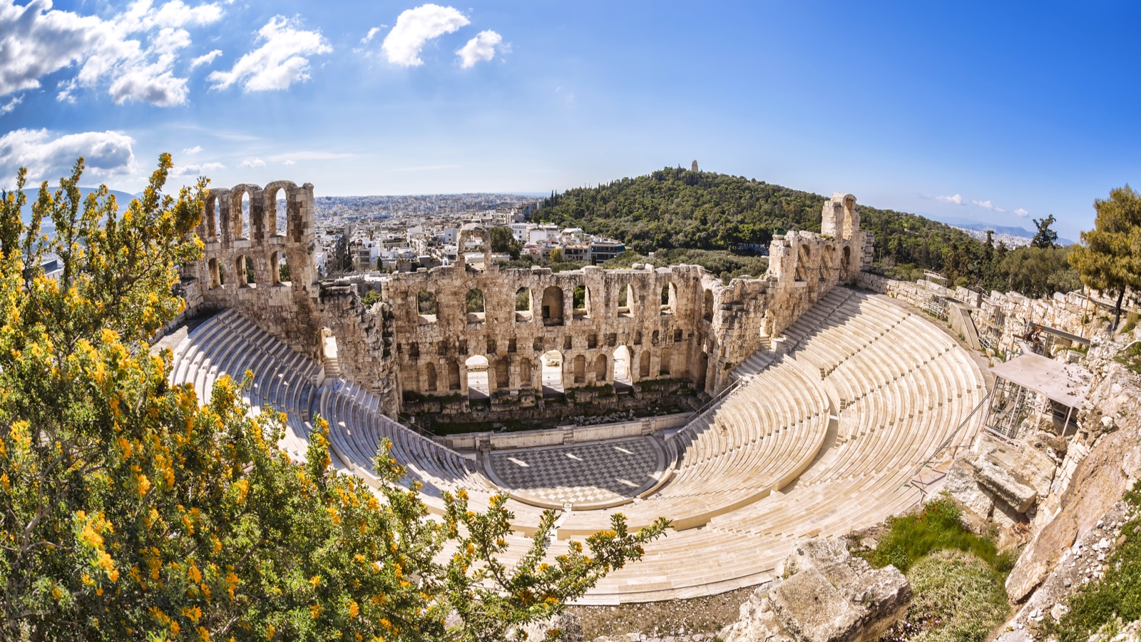
Understanding the evolution of architecture and its influence on human behavior plays a pivotal role in the design and development of not only creative workplaces but also learning spaces. Take the amphitheater, for example. The word amphitheater derives from the Greek word amphitheatron, which means "theater with seats on all sides." The stage, located in the center, aims to create a strong sense of community and promote energy flow between the audience and the actors. In ancient Rome, amphitheaters were typically used for entertainment spectacles such as gladiatorial games, poetry contests, public debates, and musical performances. Modern-day amphitheaters, used as sport and concert venues, offer the audience and the presenter an easy view from any direction and facilitate audience engagement.
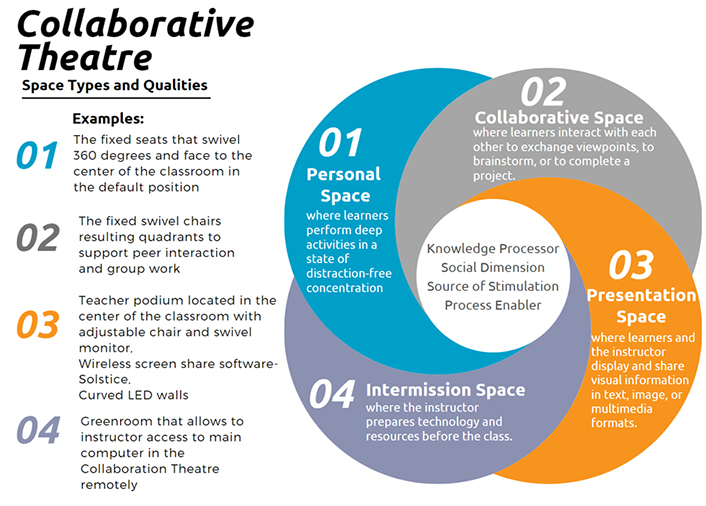
Fast forward a couple dozen centuries. In 2018, Delft University of Technology industrial design engineering faculty members Katja Thoring, Pieter Desmet, and Petra Badke-Schaub proposed a creative-space design typology that includes different space types (e.g., a personal space to study alone and reflect on learning, a collaborative space to work with peers and instructors, a presentation space, and an intermission space that connects two or more spaces) as well their related spatial qualities (e.g., transferring knowledge, facilitating social interaction, guiding the learning process, and providing key stimuli).Footnote1
Indiana University's new Collaborative Theatre combines inspiration from historical amphitheater design and modern creative-space design typology. This innovative learning space, which will open for instruction during the spring 2021 semester, was designed to promote learning, collaboration, and flexibility. I talked with two of the thought leaders and collaborators on the project, Stacy Morrone, deputy CIO at Indiana University (IU), and Julie Johnson, acting associate vice president for learning technologies at IU, and asked them to share their perspectives on the development of this oval amphitheater-shaped learning space. They provided insights about how they approached the processes, spaces, and people in the ideation and design of the Collaborative Theatre.Footnote2
Merve Basdogan: How do you define/understand "innovation" within the context of the Collaborative Theatre? What features make the Collaborative Theatre, in particular, innovative?
Stacy Morrone: We were inspired by the innovative design of the Collaborative Theatre at Oregon State University. We sought to learn what worked well for them and where there were opportunities for additional enhancements (see Figure 2).
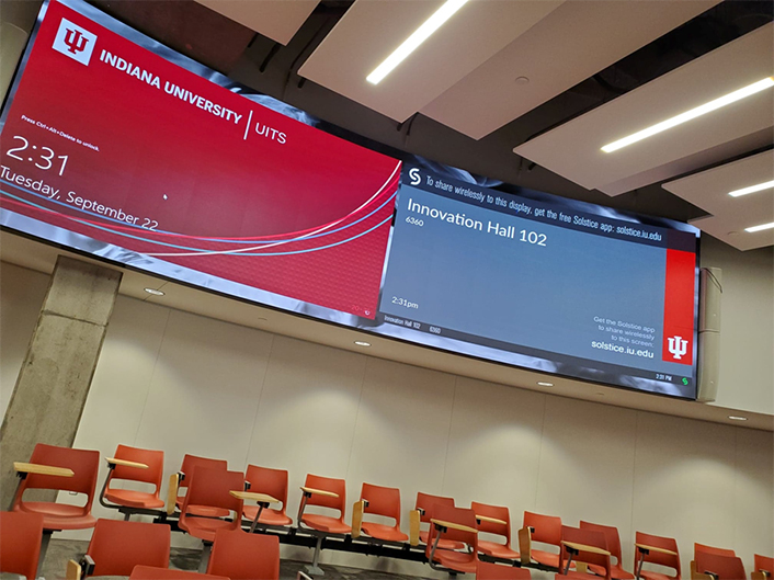
One difference in our classroom is the addition of swivel chairs that provide the ability for students to turn in their chairs so that they can cluster in small groups to better support collaborative learning. We also incorporated very high-tech curved LED walls (see Figure 3) that mirror one another on each side of the classroom.
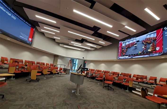
And the space is shaped like an American football rather than being a truly round classroom. The shape is efficient in terms of space, and it also brings students closer to the center of the classroom.
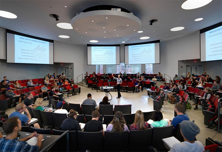
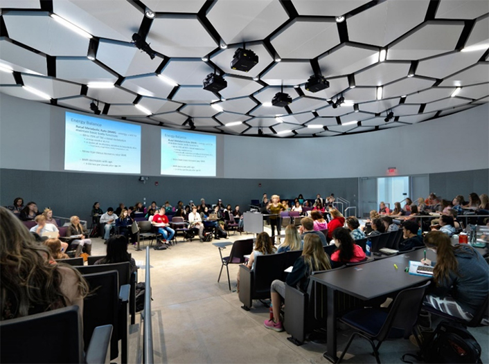
Figure 2. The 360-degree and parliament-style classrooms at the Oregon State University Learning Innovation Center.
Julie Johnson: I feel that innovation is where you get a chance to push the boundaries of what you currently do. This space, in particular, pushed the boundaries of our designs as well as our technology. Because we had never installed this type of technology in a classroom before, we had to research it to ensure it was the right solution for the space. Moving forward, we now have a new set of tools in our toolbox that we didn't have before—especially in the projection world with this new LED space that we're in (see Figure 3).
Merve Basdogan: What led to the design and development of the Collaborative Theatre?
Stacy Morrone: IUPUI [Indiana University–Purdue University Indianapolis] Chancellor Nasser Paydar was very interested in the campus having a classroom that was inspired by the classrooms at Oregon State University. The design of the Collaborative Theatre was a truly iterative design process that included excellent faculty from the School of Science and the School of Engineering and Technology. These faculty explored a variety of designs that would support their instructional practices. Interestingly, the designs initially put forward to the chancellor were ones that moved away from a round classroom design.
Chancellor Paydar affirmed that he wanted us to continue to work toward a round classroom design. So, we rolled up our sleeves and continued to work. The final design is more of an oval shape that allows the faculty to move easily from the center of the classroom to the aisles where students are working in groups—something that was important to the faculty (see Figure 4).
Julie Johnson: The instructor needs to be able to see and get to all the students, but the students also need to be able to see each other. So, this space is perfect for that. It is exactly what Stacy described, where everyone feels like they are a part of the conversation. No one feels excluded. No one is talking to the back of someone else's head like in a traditional lecture hall. Also, a faculty member can easily get to another student to create a more intimate experience for that student in a large setting. When you walk in, you do not feel like it is a large space. The design is definitely intimate. And then when you start counting how many students can sit down, you're surprised.
Merve Basdogan: How is the Collaborative Theatre different from other learning spaces? What makes it special?
Stacy Morrone: We hope that faculty who really want to teach in this space will embrace the active-learning strategies that this room affords.
Julie Johnson: This space is set up very well for basically any type of activity where you want to have authentic conversations. And it is really beautiful.
Merve Basdogan: How did you mash up the aesthetic, flexible, and collaborative aspects of the Collaborative Theatre in the design process?
Stacy Morrone: Everyone involved in this project wanted a beautiful, high-tech, and state-of-the-art classroom. We could have used projectors and put projection screens on the walls, and it would have been a perfectly fine classroom. But we wanted something that was more than that, something that was truly special, so we lobbied for the use of curved LED screens that would really blend into the wall and provide vivid images for the students.
Julie Johnson: Just to add to that, although the colors are somewhat subtle in the room, our team added a layer of creativity with the video walls. Instructors can select the imagery that displays behind their content, so they can have a background or the option to display two types of content (see Video 1). Either way, faculty can set a mood for their class with that background. I think different creative ways exist to add beauty to the space, and it is pretty spectacular. The technology is the staple to the design of the space.
Video 1. Time-lapse video showing the creation of the space.
Merve Basdogan: How do you think the Collaborative Theatre will be used during the pandemic and in the future when there are fewer constraints?
Julie Johnson: The space was designed with Catchboxes. A Catchbox is a microphone in a box. You throw it to the students, and they answer the question or have a conversation. The problem with COVID-19 is that we do not feel comfortable throwing Catchboxes around the space. Thus, we are now limited in this classroom because we did not anticipate a worldwide pandemic. Also, we have two lavalier microphones for conversations. When we get back to normal, whatever that means, the space will be wonderful for collaboration. But until we feel like we can use the Catchbox, we are a little bit limited.
Merve Basdogan: I understand that there is a separate room, like a preparation room. Can you talk a little bit about that room?
Julie Johnson: When we went to Oregon State, we watched a faculty member prepare in what is referred to as a "green room" before class. There was a class in the round room at the time, and another faculty member had arrived about fifteen minutes before her class, so she did not have access to the space. But she was still able to get her content ready. She had two different sets of instructional materials—a video and a PowerPoint presentation—which she loaded onto the computer in the green room. When the previous class let out, she was ready to go and just walked in. All she had to do was hit an input button, and everything was ready.
I thought, "I need that!" At the time, the room was only a storage room, and I was adamant that we have the ability for the instructor to prepare for class behind the scenes and make sure their content is ready. No one wants to struggle with technology in a round room when everyone's looking at them, especially if they only have three minutes before class starts.
Merve Basdogan: What did you learn during the design and development process? Were there any surprises along the way?
Stacy Morrone: We learned that we need to continue to push the envelope in ways that are important but do it efficiently, so we do not have a lot of really unique spaces that are impossible to support.
A pleasant surprise was the strong commitment to the use of a curved LED wall. This created some additional shared expense over the cost of traditional projection, but everyone saw it as a win-win for IUPUI.
Julie Johnson: Stacy mentioned earlier that there was some debate about the initial design, and we compromised on a different shape than the initial one. It was important at a leadership level for the chancellor to say, "We need to do this." He had done this before with another classroom that is now highly popular. It is imperative that leadership makes that hard decision to say we are doing this. Sometimes it's unpopular, but in the end it's embraced.
Merve Basdogan: What would you tell other institutions that are considering installing a space like this?
Stacy Morrone: I would say to be bold and to try things that have not been tried before but also learn from what others have done. We know a lot right now about what a well-designed space should look like, but we need to always be pushing for something new.
The pandemic has taught us that we need to do more to create a high-quality learning experience for everyone, whether students are joining remotely or in a physical classroom space. We have learned a lot about the importance of creativity, good engineering, and good classroom design.
Julie Johnson: If I was giving advice to another university, the only other thing I would stress is the importance of the shared vision. It doesn't matter if, for example, the technology group wants to push the envelope and trial these new features. If the other stakeholders are not equally excited about that, then you'll meet resistance, and nothing will happen. So, it comes down to stakeholder partnerships and shared vision. And in order to make these kinds of special spaces happen, someone must be willing to be bold because we might not get everything right and it's a risk.
Video 2. Innovation Hall tour through the eyes of IU Principal Learning Space Engineer Gary Cummins.
Acknowledgments
I would like to thank Stacy Morrone and Julie Johnston for this insightful conversation opportunity, as well as Sarah Engel, managing editor, IT Communications, and Tracey Birdwell, program director of the Mosaic Initiative, for their expertise and assistance in editing and proofreading this interview.
For more insights about advancing teaching and learning through IT innovation, please visit the EDUCAUSE Review Transforming Higher Ed blog as well as the EDUCAUSE Learning Initiative and Student Success web pages.
The Transforming Higher Ed blog editors welcome submissions. Please contact us at [email protected].
Notes
- Katja Thoring, Pieter Desmet, and Petra Badke-Schaub, "Creative Environments for Design Education and Practice: A Typology of Creative Spaces," Design Studies 56 (May 2018): 54–83. Jump back to footnote 1 in the text.
- Morrone and Johnson's comments have been edited for clarity and brevity. Jump back to footnote 2 in the text.
Merve Basdogan is a Doctoral Candidate at Indiana University.
© 2021 Merve Basdogan. The text of this work is licensed under a Creative Commons BY 4.0 International License.

