"Are we going to do collage?" asked a large man in a blue jumpsuit and day-glo orange tennis shoes.
"No, I don't think we'll be doing any collage, at least not for now, Bob. Sorry."
It was the first day of my first class at the local county jail. I'd signed on as a volunteer graphic design instructor, and I knew there would be challenges. But putting a 290-pound student in a deep funk within the first five minutes of class was a bad start.
That was almost two years ago. Things run more smoothly now, and I've become inured — mostly — to the drama in virtually every one of my classes. Teaching an incarcerated population has been incredibly rewarding, and I find my students to be interesting, reflective, talented, and sometimes maddeningly obstinate.
I'm a media technology consultant and lecturer at the university level. A good part of my job involves teaching basic graphic design principles to a wide range of students across a full spectrum of disciplines. My lectures and subsequent coaching sessions are available to faculty and their students on request, and recent semesters have seen a sizable and consistent increase in demand. This makes sense; virtually every field of study now requires at least some competency in visual communication.
The Problem as I See It
My frustration lies in addressing the disconnect between application fluency and content. If I have limited time to teach the basics of composition and my class is using PowerPoint as a collective sketchpad, I can safely assume that 70 percent of our session will be spent sorting through the software. That's fine in a PowerPoint class, but not in a design class. What happens, generally, is that my students walk away confused about design and PowerPoint. That's a result I'd rather avoid.
I'd prefer seeing my students leave with a decent understanding of how good design works. More importantly, I want to ensure that they will be enthused and curious about design concepts, and that they'll ultimately become the self-propelled learners we're all trying to encourage. It turns out there's a way to do that, and I have the guys in Cell Block B to thank for showing me how. Working with students at the jail has changed how I see the relationship between teaching and technology. I've reevaluated how to introduce content and technology to students and, consequently, I've reengineered my teaching on campus. My faculty partners tell me they wish I'd gone to jail a lot sooner.
Breaking into Jail
I started teaching graphic design at the jail at the suggestion of one of our faculty who had been working with Transitions, the jail's inmate education program, for over 10 years. In short order I found myself vetted, trained, and put in charge of developing my course, which would run in six-week cycles. Jail administrators were enthusiastic about the class; as a vocation, graphic design is a great fit for a guy with a criminal record. One can start small, work out of coffeeshops, and acquire clients without the ever-present cloud of a criminal record hanging over the enterprise. (Freelancers rely on their portfolio and their work ethic. Clients don't ask about jail time or even the designer's level of education. What they see is what they want.)
However — security policy at the jail prohibits inmates from using any sort of digital device. I could bring my own laptop (with the wireless networking feature disabled), but my students wouldn't be allowed near it. How on earth do you teach design without allowing students to handle the tools?
Work in Progress
I dedicated the first two weeks of class to talking about what designers do, where to get training on the outside, how to find work, and how to assemble an effective portfolio. The following two weeks were spent entirely on critiques. I brought hundreds of design examples into class, showing the students everything from menus and annual reports to logos and billboards. I showed them as much bad work as good and asked them to identify which elements contributed to success and which guaranteed failure. We kept good notes and looked for common terms to define designerly concepts such as "whitespace," "dominant element," and "tension." By the end of week two we had a good working rubric for assessing the effectiveness of any given design. Now came the hard part.

Transitions students identify what they consider to be successful contributors to effective composition as they look at literally hundreds of design artifacts. The resulting list, dumped into a word cloud, gives them a basis for mapping their future design project. (In critiquing samples, they're encouraged to look for common elements and generic terminology.)
For the final, production leg of the class, the lack of computers loomed bleakly. I briefly considered collage, sketchbooks, press-type, and flip charts, among other things. But schlepping all of this stuff through metal detectors and down narrow hallways sounded dreadful. Besides, I really wasn't interested in running a scrapbooking club for felons.
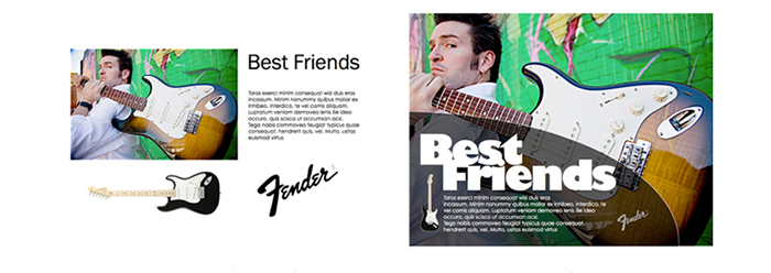
What to do? The answer was surprisingly simple and effective. After a bit of serious head-scratching, I decided to promote all of my students to art director, with me acting as their production artist. Using my laptop, I would convert their ideas into finished layouts. I put together a handful of exercises: a Fender guitar ad, a poster for a wine-tasting, a sushi menu, a business card, and the like. Each "project" had a suite of elements — headline, logo, body copy, photos, even bar codes — to include in the final composition. The guys could direct me to scale, layer, colorize, type-spec, and position the elements. (I like Apple's Keynote for this type of activity. It allows me to work with things like translucency, alpha-channel masking, layering, and such with total fluidity.)
Trying Hard Not to Wince
In short order, my "art directors" were making some incredibly bad decisions. Put the logo on the dude's shirt. Make the words really huge and orange like in a movie title... But this was good, because for the first time my students were making design mistakes, not software mistakes. The learning was dynamic and immediate. My class could see what happens to dark blue text superimposed over a red field, for instance. Or how Helvetica Neue Ultralight is "classy" enough for a wine poster, but probably too classy for a Fender guitar ad.

It sure beats collage: a before and after look at how one class designed an ad for Fender guitars. Drawing on rules and ideas they gleaned during their hours-long critiquing sessions, students built this ad in multiple ways.
Working in this mode, my classes quickly made enormous gains in understanding basic design principles. And they learned from one another in ways that economized on class time; I couldn't imagine a greater teaching efficiency. This was the freewheeling exploration I'd always dreamt of seeing in my classes. At the university, even if I filtered my workshops through the "previous-PowerPoint-experience-required" screen, the expectation of teaching this freely had never gelled.
I should mention as well that, in these working sessions at the jail, there were no lurkers. Even the most sullen of the group ultimately succumbed and jumped into the melee. I'd never have thought this, but, when it comes to design and visual messaging, everyone has an opinion. All you have to do is ask.
Did I mention that I think these classes are fun?
Creating Learners, Not Users
The classes at the jail have, through collaborative, dynamic exercise, reminded me of just how central immediacy is to learning. And that the freedom to play should be as simple and accessible as possible. In Cell Block B, it's the Rule of Thirds that gets star billing, not PowerPoint's image control sliders.
Did I tell you that my inmate students also think the design classes are fun? They routinely tell me that our workshops are the coolest thing they've ever done in jail and that when they're released, they want to learn more about the field. That's a very big deal to me. As a teacher I value the motivated student over the schooled student. That's why I'm reexamining how I teach design, across the board. I'm turning my teaching around, putting technology in the passenger seat and letting creativity hog the wheel. In time, of course, my budding designers will have to sit down to Illustrator or Photoshop and figure things out.
My goal is for them to have a mission first.

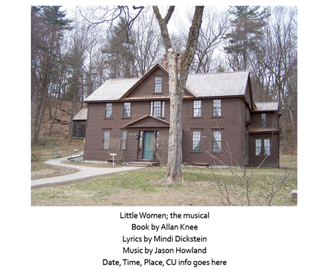
A recent class project involved designing a poster for a musical production at the University of Colorado. Students embark on projects with nothing more than text and images (in this case, Louisa May Alcott's childhood home) and work to put the pieces together in ways that are compelling, balanced, and professional.

The client, a professor at the University of Colorado, loved the gritty, almost gothic feel of the finished product (ultimately, it was not used because of contractual obligations). She saw it as a jolting departure from the style in which Little Women is typically promoted. Leave it to the guys in Cellblock B to do "jolting" really well!
© 2013 David Underwood
