
Key Takeaways
- An enterprise data warehouse serves as a foundation of reporting and analytic capability, while dashboards make it easy to consume information and gives nontechnical users the ability to access information easily.
- The business intelligence team at Arizona State University created a dashboard to track usage of the various existing dashboards and tools — putting analytics on top of analytics.
- The usage dashboard serves as a performance metric for the BI team: adoption rate is a measure of the team's success.
Whether the issue is student outcomes, research contributions, or recruitment efforts, institutions are increasingly turning to data-driven decisions rather than those based on anecdotes, emotion, or tradition. Arizona State University (ASU) recognized the need to create a data-driven culture at all levels of the institution or run the risk of falling behind the competition and the leading trends of society at large.
Developing such a culture required building business intelligence (BI) solutions to capitalize on the data collected at the institution. This quite naturally translates into building effective data warehouses and using BI tools that allow easy access to information that facilitates interpretation. This case study describes how ASU employs an enterprise data warehouse, dashboards, and data visualizations to enable truly data-driven decision making.
About ASU
Originally established as a teaching school in 1885 with 33 students, the Tempe Normal School became the Arizona State Teachers College in 1945. A vote by Arizona citizens in 1958 helped ASU become a university, and by 1994 ASU was recognized by the Carnegie Foundation for its advances in research. It is currently the nation's youngest major research institution. ASU is also among the largest (by FTE headcount) higher education institutions in the United States, with more than 72,000 students located across four distinct physical campuses. Most of this growth occurred over the past 10 years, during which the institution faced difficult financial challenges typical of public institutions across the country.
In 1993 ASU was one of the first higher education institutions to build a meaningful enterprise data warehouse and formally report on its efforts. ASU demonstrated the value of organizing operational and other data in a separate data store, enabling users of the system to write reports and do ad hoc analysis on financial, human resource, integrated student, and other data.
Building a Data-Handling Solution
In the years since, the Business Intelligence (BI) team continued construction on the data warehouse. Over time, strategic and tactical data was added to the data warehouse, including research, financial aid, census, and facility data. In addition, purchased data such as zip code and IP lookup data was added to supplement and enrich the existing data structures. With the zip code data, users can find counties/markets of students, verify address information, and browse census population information. In 2005, the number of warehouse users grew to more than 2,000. Today, the warehouse contains most of the data assets needed by the university community. The data is accessible, with appropriate security, safeguards, and training where needed.
The BI team recognized that some data (and the dashboards constructed with this data) is more important than others, so they created a dashboard that helps them track usage of the various existing dashboards and tools — putting analytics on top of analytics. In the usage dashboard shown in figure 1, the BI team can monitor in near real time which dashboards are used most and which are being adopted by departments and users; by drilling deeper into this dashboard, they can also determine information like which browsers are being used the most — important to know when doing quality assurance testing for usability. These usage dashboards help the team determine where to focus its development energies — usually on those dashboards being embraced by users. In addition, usage dashboards contain non-adopter reports listing potential users who might benefit from a particular dashboard, based on a prior usage pattern for the person's job title and/or department. Outreach to potential users has proven productive in some areas, driving further adoption. The usage dashboard thus serves as a metric for the BI team's success.
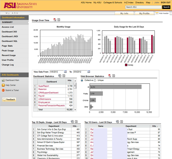
Figure 1. Usage dashboard
In the following video (5:13 minutes) author John Rome demos the usage dashboard:
ASU's solutions focus on getting results rather than on building the perfect data warehouse or tools. The investment in BI provides a path for better service while positioning the institution to deal with big data, incorporate the latest technologies into the reporting arsenal, and achieve better predictive capabilities.
Data Access and Usability Issues
The introduction of new systems makes data access more challenging. It was often said that you had to be a rocket scientist to use the new data and structures post the ERP implementation. The BI team looked at additional commercial BI software tools and started creating dashboards that were as easy to use as the web pages investors use to check stock prices. The team, augmented with student developers, built dashboards that captured a larger population of users — including technically challenged, non–rocket scientists — and were showcased in a chapter of Wayne Eckerson's book Performance Dashboards.
Implementing and Measuring BI Solutions
The BI solutions deployed at ASU helped the university tackle issues that it and other institutions struggle with, including recruitment, retention, graduation rates, and research growth. The institution is more nimble and effective with the help of business intelligence and analytics. These gains have been achieved by lowering the cost of information consumption at the university and increasing the data's reach.
For example, data from these dashboards easily identify students who are at risk of failing to meet their academic objectives or are off track for completing their degree, as indicated in the ASU eAdvisor program. Through the use of eAdvisor and aggressive retention activities, the institution's one-year persistence rate for first-time, full-time freshman students rose from 77 percent in 2004 to 84 percent in 2010; the goal is to achieve 90 percent by the end of this decade.
On the recruitment front, dashboards and other tools provide pre-enrollment indicators to help improve acceptance rates and yield.
As a tool for research, the dashboards deliver not only a single version of research activity but also a visual spark line of 36 months to help identify trends in awards, compared with proposals and expenditures.
The university is also starting to find value in data visualizations. Beyond tables, line charts, and bar charts are other visualizations that help a user consume information more easily. These visualizations include heat maps, spark lines, bullet charts, bubble and scatter charts, tree maps, tag-and-word clouds, and geographic maps. The BI team and analysts around the university are starting to deploy these visualizations more readily, especially as they become available in tools such as MS Excel, web-enabled visualizations like those provided by Google or visual software available as desktop tools. For example, a heat map of location clicks on a web page can show the places on the page that are most popular. This method has been used on several important ASU web pages not only to determine usage of links but also to assist in redesign or decisions about the placement of items on a page. Tree maps have been deployed to display hierarchical information such as number of majors within colleges, represented as a series of rectangles, with size representing quantity. This helps users see data in a new way, more than just numbers on a spreadsheet.
Meanwhile, geographical maps are going beyond just identifying where students are from. Combining geographic data with market data, population census data, or even Arizona broadband speed-up data (figure 2) helps ASU leaders determine whether the state has the capability and capacity to serve its students and how the university can improve its own services.
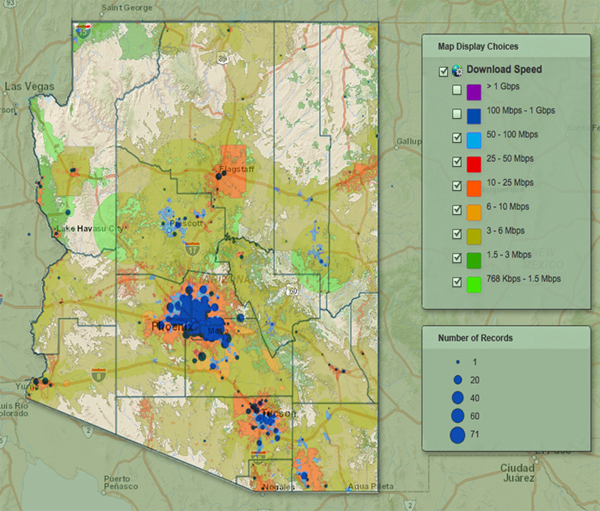
Figure 2. Heat map of download speeds and number of records
Sparking Innovation
ASU's analytics investments have enabled the institution to leverage the data that's been collecting for decades in its transactional systems. Using this data, along with the tools that enable effective visualization and decision making, has sparked innovation and is allowing ASU to positively influence the educational outcomes of many thousands of students.
Video of ASU data users talking about data and analytics at the university (11:36 minutes)
While technology and tools are not sufficient to create a data-driven university (which also requires changes in process and, potentially, structure and governance), most campuses have access to many of the same tools we use at ASU. Our underlying infrastructure is Oracle/Hyperion-based, with dashboard tools from Corda (now Domo). Proprietary tools are also available from other vendors, and open-source tools can be used as well. BI/analytical expertise is critical — but ASU has also gotten great mileage from employing bright, creative students. Most importantly, one must have people capable of asking the "right" questions, which takes knowledge and deep insight into the most fundamental academic processes. This requires close collaboration with academic leadership (the provost is our strongest supporter) and the offices that "own" those academic processes. The technology is available. At ASU, we believe that we've finally begun to realize the potential that this technology brings.
© 2012 Gordon Wishon and John Rome. The text of this EDUCAUSE Review Online article (July 2012) is licensed under the Creative Commons Attribution-NonCommercial-NoDerivs 3.0 Unported License.