Key Takeaways
- Because students have "mobile moments" throughout the day, Colorado Technical University's mobile strategy and functionality mirror mobile users' behavior of consuming "snackable" content.
- More than half of CTU's active online student population have downloaded and logged in to the university's mobile app, and those students spend more than half of their time in CTU Mobile using classroom features.
- A student-driven approach, which highlights the student user experience, is a key success factor, as explained in this case study.
- Two critical stages come after launch: collecting measurable performance data and gathering stakeholder feedback.
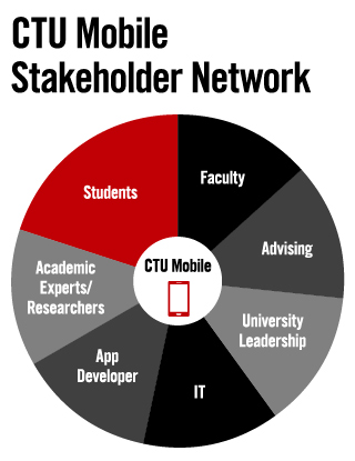
When Colorado Technical University set out to design a mobile higher education application for its students, the university's mobile development team focused on one concept: student-driven design. The design teams took cues from innovative and successful apps in other industries, including Facebook, Uber, TEDTalks, and even Angry Birds to solve problems and seamlessly fit school into students' busy days. This work succeeded in eliminating pain points and anticipating future challenges.1 Thus, the key to CTU Mobile's success was (and still is) designing an app with students and for students, making them an integral part of design, development, beta testing, ongoing testing, feedback collection, and IT planning. Student user focus groups actually changed the design path of the mobile app as they discussed day-to-day "must have" features. Plus, the involvement of university academic leadership — including faculty, student advising, and academic services — shaped the app's design and launch. Figure 1 shows the stakeholders involved in the app development project.
Four Steps to a Higher Education App

Figure 1. Key stakeholders in CTU Mobile development
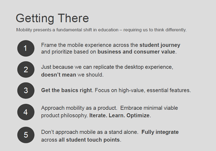
The campus team designed CTU Mobile to evolve with student wants and needs as they arise, along with advances in technology-assisted education delivery. To accomplish this, the university first adopted a new mindset for thinking about mobility and committed to a set of guiding principles for the project (figure 2). We do not consider CTU Mobile a one-off, static resource in the university's development of online educational resources but as a critical tool designed to integrate with our adaptive learning platform, intellipath™. We believe this central adherence to student success as critical in technology-enhanced education contributed to CTU Mobile and CTU being recognized with the 2016 WCET Outstanding Work (WOW) award.

Figure 2. CTU's philosophy of a "mobile first" mindset
Based on our experiences with CTU Mobile, I believe the following four steps will help other universities develop and deploy their own mobile education apps.
1. Conduct research to understand student users and discover new insights.
Like higher education, students are evolving. CTU conducted research using student focus groups, faculty feedback sessions, online surveys, and competitive market analysis to better understand our students' needs and challenges. This comprehensive sampling revealed new insights and validated features planned for development.
The competitive audits and student focus groups surfaced areas where other education apps fell short or under-delivered. These discoveries informed a roadmap, which addressed pain points and needs students regularly experience when trying to engage with education apps, and functionality thresholds and user experience design decisions. This ongoing user research and analysis drives prioritization of new features and functionality.
Our research showed that CTU students feel time constrained and make time-contingent decisions about their activities. They must prioritize between work, family, and education obligations. With today's technology, however, education can occur anywhere, anytime. To make the most of their time, students seek a mobile option to track and complete their academic goals, one that complements the desktop experience rather than simply replicating it in a mobile format.
Four prevalent student needs and opportunities surfaced in our research:
- The untethered ability to engage in classroom activities (lectures, discussions) from anywhere
- Easy access to student support staff and real-time school updates pushed to their devices
- Time-management tools to balance professional, family, and academic priorities
- Motivational support and visibility of degree progress as well as upcoming deadlines/milestones
As an ongoing practice, CTU conducts regular virtual feedback sessions with students and closely monitors tech support tickets and social media feedback to identify improvements and future functionality. Students share feedback and suggest enhancements that shape the development roadmap. For example, many students requested Touch ID and Passcode login ability, so the developers are now investigating how to make accessing the app faster and easier.
2. Create a mobile app goal that combines student needs and new opportunities.
Before embarking on the app development, CTU created a vision statement to ignite passion and creativity around the work:
By meeting students at their mobile moments, CTU will deliver real-time education that fits learning into their modern lives. CTU will embrace transparency, remove service barriers, and inspire students with personalized, portable experiences.
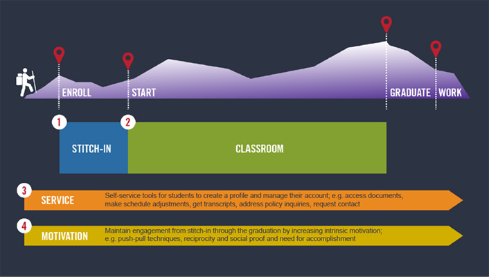
To deliver on this vision, we focused on key aspects of the student journey (figure 3):
- Classroom
- Service and Support
- New Student Onboarding
- Motivation

Figure 3. CTU student journey and mobile focus areas
An update to a legacy app, CTU Mobile was relaunched in September 2015 on Apple iOS and Android mobile and tablet platforms for students enrolled in online degree programs. In June 2016, campus-based students received access to download the app.
From the moment a student enrolls, they are encouraged to use CTU Mobile. This is a core component of the new student onboarding process beginning in admissions and orientation. Advising staff are trained to explain the benefits to students and faculty members encourage the app's use. The commitment from all university teams to promote the mobile app is critical to student adoption of the tool.
CTU Mobile App Features
A few key features align with the student's journey:
-
Access to learning anywhere, anytime: Students can participate in course live lectures, find and identify assignments, respond to discussion board posts, and submit projects.
-
Status updates: Students can track their degree progress, course grades, and upcoming assignments; plus, they're notified of new grades, replies to discussion board posts, and more.
-
One-touch support: CTU Mobile connects students to faculty, advisors, and support staff via e-mail and/or phone with a single touch.
-
Time management: Students can add tasks and deadlines to their personal calendar; they can also view a prioritized list of to-dos for the day, current week, and next week.
-
Daily motivation: Encouragement and quotes from faculty members and CTU grads
3. Define and collect academic and mobile success metrics.
Launching CTU Mobile was just the beginning of our work. Two critical stages come after launch: setting and collecting measurable performance data and gathering stakeholder feedback.
Our plan for measurement includes academic success indicators, including:
- Classroom engagement: Online students are joining the CTU Mobile app from around the world, including Alaska and Seoul, South Korea. Outside of basic app login and engagement data, we pay close attention to the amount of time mobile app users spend in the classroom areas of the app. This helps us gauge how effective the app is at enabling students to complete assignments, view announcements and tasks, and participate in live and recorded lectures. The next areas of priority include how much students engage with staff and consume university notifications.
- Ease of access and integration: Using regular student focus groups, surveys, and suggestions submitted from within the app, we are able to collect anecdotal feedback from students that helps us gauge ease of access and overall experience. Our primary goal was to provide seamless access to respond to discussion boards, use CTU's intellipath adaptive learning technology, contact the university, and play lectures on the go. Our social media communities also provide insights and validate ease of use.
- Attendance and persistence: We plan to evaluate the habits of app users vs. non-app users in critical university activities, like orientation and attendance. We are eager to see if CTU Mobile helps new students persist in their first session and helps returning students overcome time-management challenges and stay engaged in class.
In addition to university academic metrics, we will also monitor mobile success metrics:
- Adoption and use: This metric measures the overall penetration of the app among users across the student body. We track the percentage of our overall student population that uses the app and closely monitor app adoption in each new cohort.
- User satisfaction: We evaluate this factor through aggregate app store ratings in Apple iTunes and Android Google Play. Currently, app store ratings are 3.7 (out of 5) for Android and 4+ for Apple (although the most recent update has not yet been reviewed). Note that the Android rating aggregates use since the first version of the app was launched; since relaunch, roughly two-thirds of ratings posted have been five stars.
- Real-time notifications and engagement: We’ve seen many of our students accept app push notifications, which is a confirmation that they want to receive the grade updates, task reminders, and alerts for replies on their discussion board posts. This push notification channel adds new ways to engage students during their mobile moments. We also track anecdotal feedback from student reviews and in-app feedback that validates the effectiveness of the push notifications:
"Just got an alert, my paper was graded! Hit the application and got my grade. Whole thing took 15 seconds."
—Submitted in the app
"I had an instructor change the live chat time, I got a notification and was in the app, so I knew and was able to attend. Would've missed it otherwise."
—Student focus group participant
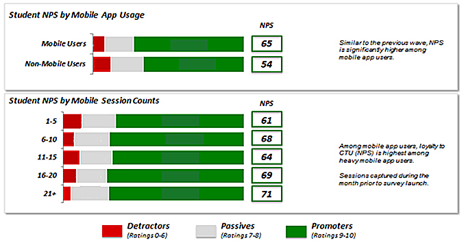
- Student experience: CTU developed Net Promotor Score (NPS) research to measure student experiences across all points in the student lifecycle. NPS is calculated by asking how likely it is that a student would recommend the university to a friend or colleague. The NPS data can be used to assess student loyalty over time and measure the influence of admissions advisors, student advisors/success coaches, financial aid advisors, and faculty in student experiences. See figure 4.

Figure 4. CTU Mobile NPS results, April 2016
In January 2016, users of CTU Mobile had an NPS of 63 (versus 58 for overall CTU students). When measured again one quarter later, in April 2016, the NPS score of CTU Mobile rose to 65. Additionally, we have seen CTU Mobile users' NPS scores increase the more they use the app — up to 69 for those who logged 16–20 sessions in the month prior to the April 2016 NPS survey and 71 for those who logged 21 or more sessions during that timeframe.
4. Commit to the long-range university vision and mission.
Student-driven projects represent one way to develop a mobile app; others include partnering with an internal IT department or external consultant. Whichever path is chosen, a student-focused vision coupled with a deliberate development commitment is essential to sustain momentum following the app's launch. Given how dynamic the mobile app space is and how quickly technology evolves, organizations considering a mobile application strategy should consider the following:
- Create a defined budget and secure long-term buy-in from leadership. University staff and faculty should be trained on how the app supports the school's overall mission so they, too, feel a sense of commitment to encouraging student use and feedback.
- Develop a roadmap — student feedback can surprise you! Watch how the minimum expectations of mobility shift, solicit feedback, and be willing to adjust your development priorities based on your students' needs.
- Commit time and resources. Creating the app involves user experience planning and graphic design. You'll also need developers for each operating system that you plan to support, as well as quality assurance engineers and API and services developers. Project and product managers will help guide and evolve the app. Once live, you'll need baseline development resources to fix bugs and make minor enhancements. Outside of development, designated representatives from the university operations team will be essential in gathering input and driving awareness across academics, advising, and other student-facing groups.
Closing Thoughts
CTU Mobile's design and features originated with the most important needs of our students, given the criticality of technology in their lives. By offering real-time notifications, time-management tools, and access to university support, we believe CTU Mobile supports student mobility by helping students fit education into their lives — not the other way around.
Note
- For mobile app experience design and user experience research, see Michael Levin, Designing Multi-Device Experiences: An Ecosystem Approach to User Experiences across Devices (Sebastopol, CA: O'Reilly Media, 2014); and Steve Krug, Don't Make Me Think, Revisited: A Common Sense Approach to Web and Mobile Usability, 3rd ed. (New Riders, 2014).
Connie Johnson ([email protected]; Twitter: @DrConnieJohnson), EdD, is Colorado Technical University's chief academic officer and provost.
© 2016 Connie Johnson. The text of this article is licensed under Creative Commons BY-NC-ND 4.0.
