
Key Takeaways
-
To facilitate decision making and planning, many higher education institutions are creating dashboards to visualize data and make it readily available to deans, their support teams, and other users across campus.
-
To succeed with such efforts, institutions must establish data governance structures, as well as ensure data stewardship and cross-institutional agreement on data definitions.
-
Another key challenge is to find ways to integrate data across a wide variety of information systems.
[This article is the third in a series that presents case studies related to important themes within enterprise IT.
- Developing Institutional Cloud Strategies
- The Impact of Cloud Implementations on Budget Strategies
- The Dean’s Information Challenge: From Data to Dashboard
- Cloud Migrations: An Opportunity for Institutional Collaboration
Each article in the series begins with a scenario that provides context for the theme, followed by several case studies.]
To identify issues and support decision making at both the departmental and institutional levels, deans and administrators look for signals and patterns in performance in areas ranging from student outcomes to financial metrics to research efforts. In theory, the advent of popular data visualization tools coupled with warehoused historical data should make it easier to integrate this data and report out results. However, that is not always the case; issues related to operational definitions, data collection tools, and ways to represent the data complicate integration and reporting tasks.
Scenario
Sara's IT staff has been collaborating with her university's institutional research office for several years to develop reports for academic leaders as background information for decision making and planning. So far, the reports are provided as one-offs on an as-needed basis. Sara recognizes an opportunity to develop dashboards that can be used across the university for a variety of purposes. However, the institution has little data governance, little agreement on data definitions, and an uneven understanding of data stewardship.
Here, four institutions share experiences and lessons learned as their deans, administrators, and IT teams developed data visualization dashboards to provide insight into their data and thereby facilitate more effective planning and decision making. As the following discussions show, all four faced and overcame similar challenges in the process.
The George Washington University
Mike Wolf, Director of Business Intelligence
Over the past several years, interest in business intelligence (BI) and data analytics has grown tremendously in higher education. New tools and technologies regularly emerge, followed closely by an army of salespeople. Often, vendors can be found in the offices of deans and other institutional leaders, promising to answer all of their questions "automagically." Unfortunately, the promises of these new tools and technologies frequently remain unmet due to institutional complexity and culture. As a result, deans often abandon new tools and return to traditional methods of answering questions.
This case study focuses on how George Washington University's Division of Information Technology (GW IT) and Business Intelligence Service team (BIS) created a Dean's Dashboard and helped drive cultural change through a combination of process, prioritization, and principals. Figure 1 shows a sample dashboard for research.
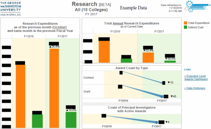
Figure 1. A sample Dean's Dashboard for research
Deans and Artisanal Decision Support
The role of dean is unique in many ways. Deans are selected for their academic excellence and leadership abilities, and are tasked with leading a critical component of a complex organization. The breadth of this responsibility is daunting, ranging from managing student experience to managing the budget and all points in between. To make well-informed decisions in this type of environment, deans must be able to draw on and understand information from a plurality of systems and processes.
As with any large institution, GW has introduced many systems independently over time to meet specific business needs. This ecosystem of databases and repositories all address various aspects of running a large private university, but frequently use different dialects. Data definitions, data quality, and data standards therefore fluctuate widely from system to system. Each system supports a unique user interface and data extraction methodology.
Deans frequently can afford to be rationally ignorant of these data complexities because staff members and institutional support offices are available to respond to their 'information requests. These individuals and groups comprise artisanal decision support — that is, they manually prepare high-quality, distinctive reports and other information products using traditional means (such as Excel).
As with any handmade product, information provided in this fashion has an elevated cost in terms of resource time and effort. To make matters worse, many requests require an information supply chain, in which multiple university community members are required to execute on a single request. This introduces a virtual "value added tax" for each resource involved in the request, and the final product is often quite brittle. If a dean asks additional questions or makes a simple change request, the process may need to start over from the beginning.
Regardless of the challenges, this artisanal approach often has strong cultural support. Deans receive the information they need, and the support staff ensures that data is used in the right context with the right business rules. Individuals providing the information also feel their contributions are important and help move the institution forward. In creating the Dean's Dashboard, our BIS team sought to automate the process of providing information to deans while maintaining some of the benefits of this artisanal decision support.
Laying the Foundation — Process and Prioritization
GW already had both a university data warehouse and enterprise BI services in place. However, before the BIS team could deliver on dashboards for deans, GW required additional foundational components in three key areas. Specifically, we had to implement a data governance process; move the BIS team to a centralized BI prioritization with an Agile Scrum development methodology; and establish a BI Community of Practice.
Data governance is a critical component for success. To this end, we implemented a centralized repository of data definitions and business terms. This repository, branded GW's Data Governance Center [https://it.gwu.edu/data-governance-center], incorporates information from both the university data warehouse and GW's various other records systems. A small team is dedicated to supporting the software and coordinating the user community. However, most governance is managed by the same support staff that traditionally provides information to the deans.
These staff members act as data stewards for the university, defining the business terms and appropriate data use in GW's dashboards and business practices. These definitions let data stewards centralize their business knowledge once and use it multiple times, rather than recreating the knowledge with every request. More importantly, this definition process helps the data stewards retain some of the benefits of the artisanal decision-support method — that is, ensuring data is used in the right context, with the right business rules — and thus further the institution's goals.
A second critical success component was to centralize BI prioritization and introduce Agile Scrum. Previously, projects were selected primarily on the basis of the customer's interest and readiness, yet it is equally important to use limited resources on the most strategically significant projects possible. To this end, the BIS team engaged a body of customers to create a Business Intelligence Advisory Council (BIAC), which included some of the deans as well as people responsible for supporting executive leadership throughout the institution.
Student information was already well represented in the university data warehouse; the BIAC quickly identified other strategic information areas to prioritize, including grants and research, finance and budget, and human resources. GW prioritized these areas for two simple reasons: deans and other leaders frequently request this information, and the information was spread across different systems and was thus difficult to quickly and reliably access.
Once the priorities were established, the BIS team used the Scrum Agile methodologies to add this information to the university data warehouse and to develop BI content for key support offices. Scrum's iterative nature let the BI team develop dashboards that provide both the breadth and depth necessary to support these key business units. This approach helped the team avoid the pitfall of rebuilding old information extracts in a new tool and also integrated the information supply chain. As a result, customers spend less time gathering data and more time analyzing information. The dashboards also played a key role in laying the foundation for the Dean's Dashboard, helping to ensure that deans receive the information they need.
The final foundational piece required to create the Dean's Dashboard was to create a BI Community of Practice (BI-COP). The BIS team does not have the resources or bandwidth to meet all of the university's BI needs. To extend GW's BI capabilities, the BIS team established a forum where power users from across the institution can share skills, information, and mutual support. This user group can create ad hoc or custom visualizations/reports and manage the demand of specific business areas. Finally, while it is impossible to anticipate when a dean might request information not yet included in existing dashboards, BI-COP members have the skills needed to deliver on unique requests.
Delivering Value to the Deans — Guiding Principles
Upon delivering various dashboards and reports to various key business units, the BIS team was pleasantly surprised by the enthusiasm and engagement of some of the deans. However, it was also immediately clear that additional steps would be needed to fully engage this audience in the BI effort. To this end, the BIS team set out to create the dashboard specifically designed for deans.
To accomplish this, the BIS team again engaged the data stewards and other support staff to identify and understand the typical information requested by deans. During this process, four simple guiding principles emerged.
Principle 1: Put the information in their hands.
Once a dashboard is complete and ready for public consumption, the BIS team engages various university stakeholders in information sessions and demos. During this process, it became clear that most deans were unlikely to seek out and interact with a dashboard on a website; t hey were much more likely to assign this task to support staff and look to them to provide a summary of the information.
Although this was a dramatic improvement over the more traditional method, it nonetheless introduced a manual process that required support over time. To address this, the BIS team enabled functionality to push PDF versions of the dashboards to the dean's e-mail on a regular basis. This strategy delivered the dashboards to deans, so they did not have to remember the web location, user credentials, or user interface. Instead, the information was available via e-mail every week at the same time.
While an improvement, this strategy introduced some new challenges. Many of the existing dashboards were designed to be interactive, with features such as rollover, filtering, and context-based highlighting. Many dashboards also required an additional level of summarization to be immediately useful for deans. Finally, deans had to review several dashboards to cover all areas under their purview. Considering these challenges together, it did not make sense to e-mail the existing collection of dashboards to the deans. However, these challenges led directly to the realization of the second principle.
Principle 2: Less is more.
The team realized that any dashboard e-mailed to deans must be designed to meet their specific needs. In addition, the dashboard must also relate directly back to the dashboards used by the support offices to avoid confusion. The only way to accomplish both tasks would be to reduce the information included in the dashboard. In other words, the team realized that less is more.
The BIS team set out to design a Dean's Dashboard that distilled existing dashboards to a format better suited for deans. Rather than sending multiple dashboards via e-mail, the various business areas were combined into a single dashboard. Key performance indicators and other measures were summarized to the school/college level. Interactive features were removed in favor of simple expressive graphics and summary values. Each subject area was presented as a unique single page, using formatting consistent with the more detailed dashboard the support offices used. Finally, the overall dashboard was designed specifically for PDF format for easy readability.
This design was well received by the testing group, which consisted of a limited number of deans and support staff. However, one key question quickly arose: "If I see a summary that I would like to examine further, how do I find out more information?" This question prompted the third principle.
Principle 3: Provide "drill through" for more information.
As the testing process showed, the Dean's Dashboard let deans quickly identify areas that they wanted to explore further. This exploration might be completed by the dean or assigned to support staff. In either case, existing interactive dashboards established to support key business units provided an ideal place to find additional information.
Providing a way to use these dashboards directly from the Dean's Dashboard became a priority. The team decided on a simple solution: insert an active URL into the Dean's Dashboard. One click on the PDF would open the Dean's Dashboard on the production BI environment and let users directly connect to the detailed interactive dashboard. Thus, users could directly "drill through" to more information. Although this solution requires more interaction from deans, it is a dramatic improvement over the previous state and limits the need for custom information requests. This solution helped the team formulate the fourth principle.
Principle 4: Shoot for good, not perfect.
The Dean's Dashboard is far from perfect. Some areas of information, such as student financial aid or student retention, are not yet available in the university data warehouse. Also, business processes that are unique to a particular school or dean are not included in the Dean's Dashboard. This is an area where the BI-COP helps fill the gap by providing supplemental information.
Despite these limitations, the BIS team moved the dashboard into production with an expectation that it will grow and change along with the university's business processes.
The availability of an easy-to-use and well-governed dashboard has dramatically increased the interest and adoption of BI from both the deans and other members of the university community. The value that this good dashboard delivers far outweighs the unrealized potential of a perfect one.
In the Future
Overall, the Dean's Dashboard was a highly successful product for the BIS team. The project's combination of process, prioritization, and principles succeeded in changing the culture when addressing the deans' information requests. Individuals supporting the deans no longer have to dedicate large portions of their time to collecting and organizing information. Instead, they can focus on analyzing information and making changes for the university's betterment. In addition, the Dean's Dashboard has spawned a complementary Division Dashboard that serves a similar purpose for executive leaders who manage university business units. Ideally, this project will provide incentives for similar efforts to meet the needs of the university's senior executive leaders, such as the provost, treasurer, and president.
New York University
Martha Taimuty, Senior Data and Information Analyst
In 2011, the New York University (NYU) Provost's Council on Science and Technology was charged with defining key metrics for the university's academic divisions. NYU's Business Intelligence and Data Warehouse team, led by Assistant Vice President Ora Fish, was tasked with incorporating those metrics into a dashboard that would meet the needs of deans, department chairs, and their support staff.
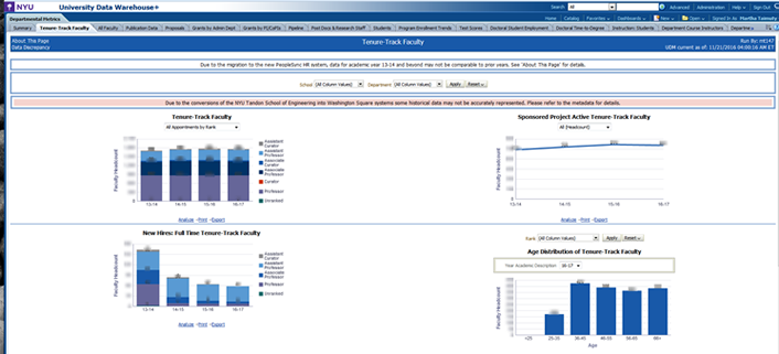
Figure 2. NYU's departmental metrics dashboard
Key elements of the university departmental metrics (UDM) project followed Fish's BI implementation methodology, which focused on integrated, conformed data warehouse design; data governance; and change management. A significant aspect of the UDM project was to gain the trust and support of the Provost's Office in both the data and the process, employing a methodology that produced quick results while addressing the challenges inherent in combining data from multiple sources. Another challenge was to influence the adoption of academic metrics in a highly decentralized culture.
Critical Success Factors
Successful development of a dashboard that would meet the needs of a large, diverse organization involved a variety of factors, both human and technical.
Involve executive sponsors. Getting leaders involved early is essential. We established a decision-making process with a small group of executive sponsors: the senior vice provost for academic analytics and graduate academic affairs, the senior vice provost for research, the senior vice dean for strategic initiatives and entrepreneurship, and Fish. They met weekly during the process to review progress and resolve questions as they arose.
Integrate data. To ensure flexibility now and in the future, we integrated data at the most granular level from several systems: the legacy HR system, the proposals administration system (Cayuse), research financials (PeopleSoft), student enrollment (PeopleSoft), and financials (PeopleSoft).
Understand context and culture. Involving core users in our process helped us better understand the context and culture surrounding academic data. Typically, deans will not log in to the dashboard and run analyses; instead, they will give those tasks to staff members. It was thus crucial to identify the people in each academic division who had the best understanding of their data and the questions facing their organization. This core group became the project's working committee, which was responsible for validating data and functionality throughout the development lifecycle. Further, incorporating this group into the project's foundation established a baseline of trust.
Focus on phases and fast delivery. Our initial set of metrics focused on areas of critical interest to academic leadership, enrollment, research, and faculty. The data warehouse team used an Agile design methodology with short, iterative phases to get these results out the door quickly. The first prototype was in front of the working committee within three months of the project launch.
Address quality issues. A data quality focus emerged early on as we faced the challenges inherent in combining data from multiple sources. Person records proved to be particularly difficult; people were present in one system but not another when pulling data from HR, grants, and proposals databases. Likewise, grants that existed in the finance system didn't have the corresponding proposals in the proposal submission system, and some proposals were never closed out. Team members resolved these data quality issues on a case-by-case basis; for example, they created a "stub" proposal in the warehouse for each grant that lacked a corresponding proposal.
Define metrics and transformations. The need to define measurable metrics was present from the initiative's start. For example, the deans were interested in measuring progress in interdisciplinary research and research output per research-active faculty member, but no clear definition existed of what constitutes interdisciplinary research or what defines active research faculty. Furthermore, the legacy faculty database did not have full-time employee (FTE) data. The team therefore had to develop these and other definitions and then programmatically address them.
Ensure design flexibility. As a large institution, NYU has many divisions and departments with distinctly different needs. Rather than try to force everyone into a single data viewpoint in the dashboard, the team used the basics of atomic granularity to provide as many slices of the data as needed. For example, some deans wanted to view their grants data by administering department, while others wanted to see it by principal investigator. By building the model at the most granular level, the team could provide multiple views and then let users choose the slice that best met their needs.
Concluding Advice? Be Patient
Adoption and penetration among academics takes time and leadership's support. As our project progressed and dashboard iterations became available, Fish and the executive sponsors embarked on a "road show," demonstrating the dashboard at meetings and events and listening to the discussions that followed. Each phase garnered better questions as the community grew more sophisticated in their data use and their trust in the system grew. In our case, patience proved to be the key to shifting the data culture.
Establishing the working committee as part of the project's foundation, having visible leadership from the Provost's Office, and supporting the dashboard with proven design principles grew trust among academic administrators, who heard about the dashboard from both their staff and peers and saw senior leadership's commitment to it.
Our first prototype was released four years ago, and usage has grown incrementally. In the past year alone, use of the UDM dashboard tripled across the institution. Of the 2,500 BI users across NYU today, approximately 250 use the UDM dashboard.
Purdue University
Monal Patel, Director of Institutional Research
The need for data, whether presented in a standard report or graphical dashboard, transcends institutional levels. Everyone needs data to fulfill daily job functions and assist in planning for future requirements. These data needs can range from simple aggregate numbers sliced and diced by various measures to statistics represented in histograms, box plots, and standard deviations.
Given this broad need for data in higher education, data consumers — who range from students to HR staff to financial experts — inevitably vary in their skill levels. Even experienced data users, who are typically familiar with data in their own job realm, might be less familiar with data from other institutional areas. Novice data users often struggle with exact definitions of the metrics, but must nonetheless draw quick conclusions from the data presented to them. Thus, the challenge for dashboard developers is to create informative dashboards for disparate subject areas and expertise levels, while eliminating the need for numerous dashboards that differ only slightly to meet specialized needs.
Data Users and Their Needs
As with many other institutions, Purdue University's deans and executives have specific data needs. Deans focus on the overall health of their academic units to meet the institution's goals of quality teaching, student success, and effective use of institutional resources.
Key metrics related to teaching include student credit hours by faculty rank, number of classes taught by course level and faculty rank, and enrollment load by faculty rank; these measures vary as we aggregate up to the college/university level and disaggregate down to the department or discipline level. Performance metrics related to student success include retention/graduation rates, grade-point averages, time required to earn a degree, and postgraduation placement rates. Measuring effective resource use relates to factors such as the use of campus space and the student-to-faculty ratio.
Our question going in was: How different are the metrics that deans use from those used by any department head, data manager, or central administrator? In some cases, there are differences. But in many cases, the questions asked are similar, if not the same. This idea guided our development process.
Purdue University's Data Digest dashboards strive to meet our deans' needs to evaluate their units' overall health, while at the same time meeting the information needs of the broader Purdue community.
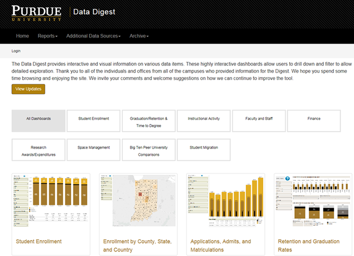
Figure 3. An example Data Digest dashboard
Challenges
The broad data needs of deans present not only a data visualization and IT development challenge but also a data definition and governance challenge. For data visualization, key requirements are ease of use and easily understood visualizations to accommodate the deans' busy schedules. To achieve the latter, important metrics should be shown first, with options to let them drill down into details or drill up for overall key performance metrics.
Another IT challenge is the disparate data sources on most campuses. Developers typically must corral data sources from several systems into a standard format to concisely display data on the dashboard. However, in doing so, they must be careful not to manipulate the data to the extent that it fails to match the original sources; developers therefore must employ the utmost care and diligence in validating and verifying the delivered metrics.
Although data definition and governance have long existed, their importance has increased recently due to centralized data warehousing, as well as to information overload and increased access to data. In most institutions, information culture has changed from "ask for the report from the central office" to "run (or create) the report yourself." Standard metric definitions and training opportunities are thus needed to avoid the risks associated with users misinterpreting metrics or, worse, using incorrect numbers to make important decisions.
Keys to Success
At Purdue University, our data definitions were compiled through a collaborative effort in which various central areas "owned" specific metrics. We published the resulting data dictionary on the Office of Institutional Research, Assessment and Effectiveness website. In addition, Purdue established governing committees to manage standards for published dashboards and enterprise reports. These committees consist of members from central administrative areas and academic units.
Through this collaborative dashboard development process, Purdue embarked on a journey to not only govern standards for delivered dashboards and reports, but also to ensure data integrity on the metrics delivered. Data integrity is an essential component to build value and acceptance of the dashboards, while the extra effort invested in data governance pays off in terms of information reliability.
Results and Future Plans
Purdue University realized the need for data dashboards to serve a variety of users and integrate information across a variety of data sources. Meeting this need through one set of dashboards provides a one-stop shop for users. Governing the look-and-feel standards, while also validating the metrics and verifying that they adhere to approved definitions, ices the cake for dashboard usability. The Data Digest dashboards are currently in use by Purdue's Office of the Provost and the Academic Program Review's academic deans.
Purdue is in the early days of implementing a data governance role to facilitate discussions among key stakeholders. The discussions will focus on standard data definitions, data training, and a united dashboard roadmap.
A result of the need for a dean's dashboard culminated in the concept of management dashboards, which require a secure login and are visible only to those who need the information. Specific to deans and executives, they are designed to answer daily trend types of questions pertaining to admission yield tracking, destinations of students who did not matriculate to Purdue and where they did enroll, and enrollment in courses on a daily basis under the course registration timeframe. Planned additional management dashboards will pertain to budget and financial data.
University of Rochester
Jeffrey Meteyer, Manager, Data Warehouse and Reporting and Analysis
Data drives dashboard construction. At the University of Rochester, our dashboard development teams sought assistance and created processes to ensure consistent results and widely agreed-on metric definitions. These experiences inspired data governance and communication partnerships across various systems.
This case study focuses on issues of interest to deans and the challenges of developing a dashboard system.
The Dean's Perspective
New and existing deans face daunting pressures in managing their areas of responsibility; among their required tasks are to:
- Develop student outcomes strategy
- Understand the unit's financial position, as well as its operational and academic standings
- Interpret information from an avalanche of data from various (potentially non-integrated) sources
- Ensure the effective and efficient use of resources related to finances, people, and space
- Engage and support cost/value discussions around tuition and student job market success
- Solicit research dollars in targeted areas of opportunity
- Make strategic faculty hiring decisions and develop faculty retention strategies
Deans are interested in existing performance metrics and how they portray both current and historical performance. But, in attempting to address such questions, deans might find themselves in information silos — sometimes without realizing it. Sometimes these "silos" result from institutional evolution, as described below.
When deans rise through the ranks of a particular institutional branch, they might be unaware of "tribal" knowledge from other parts of the institution. Further, they often rely on subject matter experts to help lead the way in terms of definition and performance. However, some measurements, such as student metrics, do not behave according to a predictable data-driven model across an entire university. In addition, some deans might hail from other institutions with particular dashboard cultures and expectation levels. These deans might believe it is easier to bring this "vision" to their new establishment, only to find that the new institution's data might not easily suit or fully populate the former institution's dashboard model. Deans might find themselves without an existing dashboard model, so the activity of designing one becomes an additional task to manage.
Deans have reporting priorities beyond the student area, including research ranks, investment trends, salary expenditures, and submission/acceptance ratios for research projects. Deans might focus on the workload ratio of various faculty members or principal investigators in relation to research time, student course load, and mentoring. Further, tenure tracking and overall demographic measures play a role in both recruiting new talent and retaining existing performers.
Financial reporting priorities may include operational metrics, which indicate where a dean's unit stands in relation to its plan or budget and (ideally) in relation to previous timeframes. Forecasting future fiscal cycles is challenging in the absence of historical data and an understanding of how that data relates to prediction models.
When data definitions vary, exceptions or anomalies can arise in the metrics using those varying definitions. Many people in an institution's higher ranks have gone through evolving organizations where successive leaders invented new ways of thinking and addressing organizational shortfalls to establish their influence on the institution's practices. However, deans and administrators do not want to risk misinterpretation or misstep due to nebulous data definitions; they want to be relatively certain, given the data integrity and interpretation, that the decisions they make align with their strategy.
The recent rise in data governance teams — which address issues such as data definition, data security, and determining usage at various institutional levels — is helping to establish process-driven decision-making, reducing the challenges of data sharing and interpretation previously experienced by deans and others.
Data Challenges
When designing dashboards as information portals, it is important to ask what the appropriate metric is and how it will be used for decision making. A visualization or reporting team sometimes illustrates what can be done, but their design intentions might actually muddy the dean's decision-making process. The goal should be to define the metric in as granular a way as possible so that the resulting illustration of that metric helps users determine a course of action.
For example, a five-year trend in research spending (in aggregate) might give users a sense of what to expect for forecasting, but if the goals are at the sublevel (such as capital expense reduction), the data sets should be represented so that users can easily identify distinct signals or trends without having to redesign a report. Setting thresholds and alert logic is important; data sets arrive quickly, and the buildup lets user see the signal and act accordingly. If data does not refresh often enough, the signal may be lost or delayed, resulting in missed opportunity.
Development Process
At the University of Rochester, our reporting and analytics team worked in tandem with then-Dean Robert Clark and the dean's support staff to outline a vision for developing institutional dashboards. The dean offered a level of creative freedom, letting the team illustrate the dashboard design and as a group define the resulting metrics.
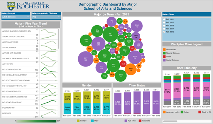
Figure 4. An example institutional dashboard
The team developed various proofs of concept showing the information that could be gleaned from the data warehouse and other systems across the decentralized institution. Multiple review sessions ensued, in which team members explained why they thought a particular visual accurately represented a metric's performance over time. Our mantra throughout the design process was: keep the message simple, while also ensuring that a single visualization could answer multiple questions. The challenge was in defining which level of information provided sufficient actionable support, versus having a visualization that drilled down a "discovery wormhole."
Defining data elements — and finding agreement on those definitions among contributing parties — proved to be an ongoing challenge. Although we reached agreement for the initial round of institutional dashboards, the process pointed to the need for data governance. We are investigating tools such as iData's Cookbook, which can help an organization capture and publish data definitions that require a structured approval process, as being the authoritative source. A recognized source containing definitions for terms, metrics, and reports can help the team maintain consistency in the design and development of reporting and analytics.
Our data analysis team learned the importance of understanding how data definitions matured over time and the different ways data was collected and classified in the information systems. This understanding sometimes led to the development of bridges between data transformations to allow presentation of a continuous data story. Special events, such as ERP or other system replacements, drove the need to consider which data definitions and transformations are needed and how a data conversion strategy reaches beyond the source system to reporting systems. Weeks of data modeling and cleanup ensued; our goal was to assure users that we could tie the ends together and portray multiyear windows of trends.
Results
After nine months, we arrived at an agreed-to set of institutional dashboards that worked to illustrate student, faculty, and research relationships and performance over time. We designed the visualizations to allow multiple questions to be asked and answered, and included various parameters that users could manipulate to discover results. We also addressed the granular versus aggregated views to allow "drill-throughs" when security rules permitted access.
Dashboarding might seem like another reporting project. However, we encountered many variations in grey requirements and acceptance of visualization "art" for the final deliverables — what worked as a pie chart one week worked better as a bar chart the following week — and thus helped us to exceed many of our resource forecasts. The bridge between data graphing and the "story to be told" can be vast, and the environments and issues at the time can influence how a visualization represents data. At the same time, adhering to standard, defined metrics over time helps solidify and standardize how the visualization can illustrate performance variations. Further, adhering to strong data definitions reduces the translation risk for data extending across multiple instances.
In our case, data cleanliness issues and deciding how to portray data certainly exceeded our original two-week time estimate. However, our hope is that we have now put processes in place to reduce the development timeline to a more manageable timeframe, driven by agile scheduling, reusable components, and standards.
Future Plans
A dashboard effort can lead to analysis paralysis if the signaling features are not strong enough to point out anomalies. A visualization can become stale — like a roadside billboard you learn to ignore. It's important to employ processes to provide data-driven refreshes that show new situations, as well as the effect of decisions made based on previously illustrated data. This correlating between data and action helps prove the worth of tracking information and displaying results to confirm how a strategy fared.
iven human tendencies toward instant gratification, dashboards must produce quick responses to actions at a level granular enough to show correlation. As deans continue to work under various pressures, their ability to measure performance rapidly and discover details that serve the goals are critical dashboard deliverables. As their strategic partner, it is imperative that IT teams help deans address data cleanliness, definition, and refresh concerns.
IT Leadership Is Key
For colleges and universities, lack of data is not usually a problem. Getting information to academic decision makers, however, is not so easy. The problems involved are not merely technical issues such as data integration; to create dashboards and reports that help deans and administrators make decisions, IT leaders must help their institutions develop data governance, build agreement around data definitions, understand data stewardship, and communicate across silos to reach agreement on dashboard goals.
The lessons learned from these four case studies can be a roadmap for other institutions as they work to provide academic leaders the information they need to make effective and fruitful decisions.
Mike Wolf is director of business intelligence, The George Washington University.
Martha Taimuty is senior data and information analyst, New York University.
Monal Patel is director of Institutional Research, Purdue University.
Jeffrey Meteyer is manager, Data Warehouse, Reporting and Analysis, University of Rochester.
© 2016 Mike Wolf, Martha Taimuty, Monal Patel, and Jeffrey Meteyer. The text of this article is licensed under Creative Commons BY-NC-ND 4.0.