Key Takeaways
- Producers of web-video instruction need to negotiate old and new rules of video grammar to remain credible (to the traditional video grammar) as they also strive to be cool (in the new media video grammar).
- The goal is to avoid violating traditional video grammar while tapping into new video aesthetics to gain ethos with web-savvy audiences (like students).
- This tutorial explains the best old and new practices in creating talking heads web video for maximum impact and effectiveness.
Once the province of trained professionals with expensive equipment, video production now seems open to anyone. While the gatekeeping control of "broadcast quality" has been breached by the shoot-and-share culture of the web, the young people driving this new video culture not only are Internet savvy but also have grown up with intense exposure to television. Because they have absorbed conventional video production rules in much the same way native speakers absorb their language's spoken grammar, they know when video violates television's video grammar even if they cannot state the rules. Thus, those who self-produce instructional video for the web need to be aware of traditional video aesthetics (the old rules) that form a sort of video grammar born for the big screen, carried to the television screen, and now onto the microscreen of YouTube and mobile telephones. In addition, we see evidence that web video is using some new video production grammars and believe that producers of instructional video on the web can benefit by becoming aware of new rules as well as old rules.
The emerging grammar for the microscreen of web video proceeds along two trajectories:
- Its first and most important goal is to avoid violating traditional video grammar and potentially losing credibility.
- Its second goal is to tap into new video aesthetics and potentially gain ethos with web-savvy audiences.
These goals form an uneasy merger of past and present, but one that producers of web-video instruction need to negotiate so that they remain credible (to the older video grammar) as they also reach for the cool (in the new media video grammar).
On Not Breaking Traditional Video Rules
Not only do the traditional rules of video production establish credibility with older audiences, they also play on the viewing habits of younger, web-savvy (but still television-saturated) audiences who are most likely to view instructional web videos. Producing web video for instruction, to put it straightforwardly, rewards those who can balance the new and cool aesthetics with the old and credible ones.
10 Production Grammar Rules for Traditional Video Composition
- Speaker is framed using the rule of thirds.
- Speaker is framed in distinct establishing, medium, or close-up shots.
- Sequence of shots moves from wider to closer shots.
- "Jump cuts" are covered with cutaway shots or changes of framing.
- Speaker talks directly to camera to emphasize ethos (a news announcer, for example).
- Speaker talks slightly off-camera, as to interviewer, to emphasize credibility.
- Frame of shot gives "talking room" in direction speaker is looking.
- Three-point lighting (key, fill, and back lights) is used on speaker.
- Background is meaningful but not distracting.
- Speaker can look left, right, and down in frame, but usually not up.
A problem for moving traditional rules to a microscreen is that wide establishing shots can no longer be seen clearly; even a traditional medium shot is not always meaningful. Limitations on frame size reduce the sense of setting of a video and also reduce options for editing talking head videos. Since traditional head-shot video counts on changes of framing (such as medium to close-up), how do you "cover the edits" as traditional rules dictate? Blogger Ze Frank redefines the rules to allow some jump cuts (cutting out footage in the middle of a shot, which seems to make the on-screen subject "jump" to a slightly different position) and other times to cut from close-up to extreme close-up shots.1 Instructors who understand the grammar of video can manage the limitations of microscreen video, applying rules for traditional credibility or strategically breaking the rules for new-media cool.
Talking about "Talking Heads": Four Dimensions
Video producers (including people who shoot video of themselves) have four video production dimensions to consider in composing a talking head shot: framing, background, lighting, and audio. (The nine-minute screencast included with this article shows how each of those four dimensions is treated in video blogs, considering the interplay of new and old rules.) As with grammar, viewers may not be able to articulate the rules associated with these dimensions, but they notice violations, so much so that ignoring them can make a video appear amateurish or, worse, make the on-camera speaker appear less credible.
Framing
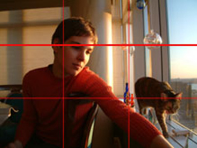
Composing a talking head video starts with framing the shot, which is done very much as a photographer would frame a portrait. The most discussed principle of framing, the rule of thirds (see Figure 1), involves drawing imaginary lines that divide the frame into thirds horizontally and vertically.2 The speakers' eyes in a talking head shot should be placed along these lines and especially at the intersection of lines. Once you become consciously aware of the rule of thirds (your eye already "knows" the rule), you will see it in art, architecture, advertising, magazines, movies, and television.

Figure 1. Rule-of-Thirds Framing (from Hippasus.com)
Video composition also entails using a sequence of shots to build context, moving from wide to tight: establishing, medium, close-up, and extreme close-up. Traditional video principles suggest starting a video sequence with an establishing shot that shows the speaker in an authentic setting, then cutting to a medium shot (typically the upper half of the speaker's body), and then settling on a close-up that frames the speaker's head and shoulders. Extreme close-ups frame part of a speaker's face, usually cutting off the top of the head to keep the speaker's eyes about one-third down from the top of the frame. Because web video is never larger than a laptop screen and may be as small as the microscreen of a mobile phone, talking head videos for web distribution often bypass establishing shots and even medium shots in favor of close-up and extreme close-up shots.
Camera angle also contributes to framing a talking head. Having the camera at the speaker's eye level is traditional, but different camera angles add interest. However, avoid an up angle (often shot by a computer webcam) unless you want the speaker to appear humorous or dishonest. To correct for the webcam's position, place the computer on a box so that the camera is at the speaker's eye level or higher.
Background
An appropriate background should add context or setting, but not distract from the speaker or topic. A speaker who is looking off-camera should have more background visible in the direction that she is looking. A speaker who is looking directly at the camera can also be placed a bit off-center to show more background (taking advantage of widescreen framing that is otherwise wasted on most talking head shots). Placing the speaker at a distance from the background and much closer to the camera can lend a sense of dimensionality, especially if the background is slightly out of focus (shallow depth of field).
Lighting
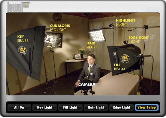
Lighting is a third dimension of traditional head-shot composition. Three-point lighting—which can be explored interactively on Lowel Lights education website (Lowel EDU; Figure 2)3—is standard for traditional video. Self-producers of instructional videos, however, usually don't have access to a full light kit or the technical knowledge to light artfully. The challenges for nonprofessionals are making the most of available lighting and avoiding issues such as a bright background that can cause a consumer-level camcorder's automatic iris to close and produce unintentional silhouette effects. Videographers also need to be aware that indoor settings tend to look darker to the camera than to the eye and that the flip-out camcorder view screen can make a scene look brighter than the camcorder will record.

Figure 2. Three-Point Lighting (from Lowel EDU)
Light also has color temperature to consider. Tungsten bulbs emit warm, pleasingly yellow or reddish light, while fluorescent lights cast a not so pleasing greenish tint. Placing a speaker near an outside window can increase the amount of light, but if the window shows in the shot, it may have a bluish look. Shooting outdoors, especially on an overcast day, can assure good light intensity and temperature. Indeed, movie directors often shoot early and late in the day (the magic hours) to capture the color temperature and shadows. However, shooting outdoors requires a content motivation and establishing shot (for example, outside a school). Shooting outdoors also introduces audio concerns, including loud or distracting sounds such as traffic.
Audio
Audio in traditional video is gathered with a lavaliere (tie-clasp) or a shotgun microphone placed just outside the camera frame. But precious few consumer-level camcorders have an external microphone input, so web video audio is usually recorded by the camcorder's internal microphone or by a webcam and computer microphone (often a low-quality component). Relying on internal microphones requires the producer to creatively keep the camcorder or computer microphone within three to four feet of the speaker or risk the video being spoiled by uneven, unusable sound.
Talking Head Videos on the Web
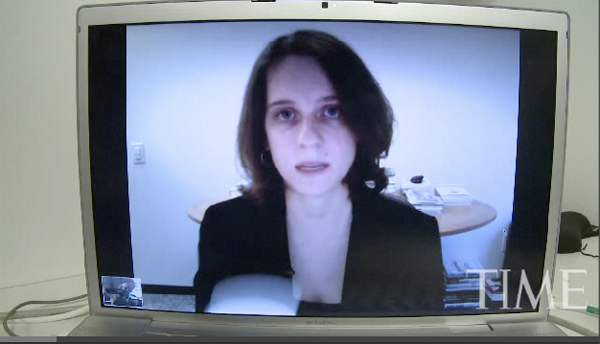
Whether purposefully or not, all videos are productions. Talking head videos may capture a streaming event, such as an online conference, a meeting, a class, or even a job interview. Or they may be edited and use changes of camera angle or cutting away from the talking head to illustrative video or graphics in order to cover edits and enhance instruction—for example, a TED talk or a "how to" video. Whether rolling live or editing later, the microscreen composition has to create and sustain interest when the primary focus is someone's head. Barbara Kiviat's video "How to Ace a Job Interview on Skype" (Figure 3)4 aims to prepare someone to compose a live video event, presenting the interviewee credibly. It frames a standard medium shot, using the rule of thirds with the interviewee's eyes a third of the way down the screen. The webcam is positioned to shoot at a slight down angle rather than the typical webcam up angle, although light from the computer screen creates unbecoming up-angle lighting. The background suggests a business setting, although not artfully. The interviewee is close enough to the computer webcam to assume decent audio quality. As is typical of video that is both live and high-stakes, the approach is very conservative; there are no gross violations of traditional video grammar that could hurt the interviewee's credibility. But the composition of this talking head video also doesn't enhance the interviewee's image to "ace" level, much less add any cool factor, though a job interviewee is more interested in credible than cool.

Figure 3. Freeze Frame from "How to Ace a Skype Interview" (time.com)
Video bloggers who are not streaming live may still record "live to tape" or edit their videos to increase the production value. In any case, they need to grab and hold the fleeting attention of web viewers. They still need to be credible, but they also need to be cool.
Amping Up Web Video with New Rules
Early video blogger Josea Jan "Ze" Frank added a short video rant, called "the show with zefrank," to his blog in 2006 and posted a new episode every weekday—250 episodes—before retiring the feature.5 Over the course of this video blog, or vlog, Frank appeared to break traditional grammar rules for headshots and began to offer new rules for a web video grammar (Figure 4, showing original framing).


Figure 4. Ze Frank, Close-Up and Extreme Close-Up Shots (from zefrank.com)
In the show Ze Frank fixes a maniacal, wide-eyed stare at the camera while he delivers a stream of consciousness rant-of-the-day. The effect is heightened by editing to a newly framed head shot every five to ten seconds, which not only created the no blinking or breathing look but also allowed him to record his rant in short segments that could be edited into the apparently improvised rant.
Over the course of its one-year run the show codified some new rules for an "edgy" web video grammar that emphasizes looking informal and not overly produced.
New Rules for "Edgy" Microscreen Video Composition
- Some jump cuts are allowed, to add pacing.
- "Edge" is achieved through quick cutting between shots.
- The traditional wide shot to establish context is not used.
- Background carries context, if context is shown.
- Stark lighting is allowed.
- Extreme close-ups are used to emphasize important points.
- Camcorder-quality audio is acceptable.
Web video aesthetics have evolved to work within the constraints of consumer camcorders, limited video production tools (such as lights and microphones), and modest technical expertise, as well as limited production time and funds. Web video aesthetics can also free instructional video producers from conventional assumptions that instructional video needs to be "broadcast quality" to be accepted by viewers who are accustomed to television and movies.7 Whether you produce instructional videos for your students or encourage them to create their own videos for class, understanding both the traditional and new-media grammar rules enables you to create web videos that communicate the image you want — be it cool or credible, or even both — to your audience.
Video Tutorial on Composing "Talking Head" Web Video
The screencast video that accompanies this article analyzes education blogger Richard Byrnes' first attempts at producing a vlog (in screencast), and then looks at two established video bloggers for potential production tips. Roberta Munroe (in screencast) and Ze Frank represent good, if vastly different, examples of web video that show producers of instructional video how they can use awareness of old and new rules to boost both the credibility and the cool quotient of their web videos.
Peter Fadde provides a video tutorial on creating talking head videos following the advice in this article (9:00):
For key points made in the video and sources for the videos included, see the PDF "Cool and Credible Web Video."
- P. Sullivan and P. J. Fadde, "Guerrilla Video: Adjudicating the Credible and the Cool," The Writing Instructor (May 2010).
- Hippasus, "Digital Storytelling: The Rule of Thirds."
- Lowel EDU, "Learning to Light Better."
- Barbara Kiviat, "How to Ace a Job Interview on Skype," Time.com, October 30, 2009.
- J. Bourne and D. Burstein, Web Video: Making It Great, Getting It Noticed (Berkeley, CA: Peachpit, 2009).
- Ze Frank, "Supabah," the show with zefrank, February 1, 2007.
- S. M. Alessi and S. R. Trollip, Multimedia for Learning: Methods and Development, 3rd ed. (Boston: Allyn & Bacon, 2001).
© 2011 Peter J. Fadde and Patricia Sullivan. The text of this EQ article is licensed under the Creative Commons Attribution-Share Alike 3.0 license.
