Key Takeaways
- Web-enabled smartphones (and their applications) have converged with cloud computing to change the ways people interact with each other and their environments.
- The academic community has only recently adopted mobile technology, and the few existing studies focus on one or two institutions rather than taking a cross-institutional view of mobile websites.
- The study reported here examined the mobile websites of large research universities and their libraries in the United States and Canada.
- Results found that few functions on university mobile websites clearly addressed educational needs, highlighting an opportunity to provide more educational links and applications.
The convergence of web-enabled smartphones, the applications designed for smartphone interfaces, and cloud computing is rapidly changing how people interact with each other and with their environments. The commercial sector has taken the lead in creating mobile websites that leverage the capacities of smartphones, and the academic community has begun to follow suit. MIT and Stanford University launched mobile websites in June and October, 2008, respectively,1 with many more university mobile websites launched throughout 2009.2 Given this relatively recent adoption of mobile technology by the academic community, the handful of studies completed examine how people use academic mobile websites or identify what information/services they want to access via the mobile web and tend to focus on one or two institutions rather than a cross-section of mobile websites across multiple institutions. Cross-sectional studies identify the types of services commonly offered while allowing for comparisons between what is offered and what users want or need to access using the mobile web.
The study reported in this article examines the mobile websites of large research universities and their libraries in the United States and Canada. The services available on different university and library mobile websites are compared and contrasted with the literature identifying what mobile web users desire. This analysis across multiple mobile websites provides universities and their libraries with an initial benchmark for comparisons with other institutions. Future research on the mobile web can identify trends and design issues that are currently only objects of speculation.
Ecology of the Mobile Web
The Pew Foundation reported that 32 percent of Americans had accessed the web using a mobile device by April 2009 compared to only 24 percent in December 2007, and 58 percent of 18-29 year olds have used the web on a mobile device.3 Worldwide demand for smartphones increased 30 percent last year and continues to grow.4
The mobile web provides much of the functionality for smartphones and other computing devices. Because smartphones can access web-based content, it is easy to treat the mobile web as the full web viewed through a smartphone.5 However, as Alexandra Mars pointed out, smartphones are not miniature PCs but "a whole ecosystem with its own set of rules."6 The mobile web has special constraints, is ubiquitous, and fosters a digital rather than analog orientation by its users. Because of these characteristics, the mobile web is an integral part of the devices used to access it, to the point that the mobile web refers to any web-based content or function configured for access through mobile devices.
Smartphones, like computers in general, are evolving toward miniaturization.7 The resulting tiny screen displays and keyboards constrain their use, especially when interacting with the full web. Non-mobile optimized websites force mobile users to scroll extensively, making page navigation difficult.8 Mobile users thus gravitate to mobile-optimized sites when possible.9
First proposed by Mark Weiser in 1991, ubiquitous computing describes an environment where individuals would be surrounded by hundreds of computers of different sizes and shapes, with each computer serving a different and specialized set of functions.10 Perhaps his most important contribution was recognizing that the real functionality of ubiquitous computing resided not in devices but in applications such as people locators and collaboration tools such as shared drawing programs11 that connect electronic information to objects in the physical world.12 People locators and collaboration tools, like many higher order apps, require the active exchange of information.
Information can be accessed and delivered passively or actively. Passive information is flat or static in nature and can be presented to the user with no further interaction beyond the initial request. Information delivered actively facilitates action that results in a direct change to the user's situation. The context-aware and collaborative applications envisioned as key features of ubiquitous computing promote the active exchange of information.
The evolution of ubiquitous computing has taken an interesting twist: Many of the functions Weiser saw as foundational to ubiquitous computing are realized today through smartphones capable of running hundreds of apps in a mostly seamless wireless environment. The iPhone is the current embodiment of ubiquitous computing, with over 152,000 apps13 and built-in features such as GPS and a high-resolution camera. Smartphones represent a "Swiss Army knife" for ubiquitous computing — an elegantly simple device that is easily carried and has multiple functions capable of satisfying everyday information needs.14
Commercial organizations take advantage of smartphones' characteristics to offer goods and services to their customers. Banks use the GPS feature in apps that leverage the user's location by providing targeted information such as the nearest automatic teller machine.15 Insurance companies16 have deployed apps that let customers access their accounts, obtain checklists on what to do following an accident, and initiate the claims process.17 Retail stores provide mobile web access to goods through specific store apps or through links embedded within online advertisements.18 Pizza chains, where food orders include an assemblage of ingredients and choices, are promoting apps that allow customers to create and order pizzas online. This saves time, improves the accuracy of orders, and creates a customer database for future orders.19 The ability to pay for goods and services using a smartphone is part of this dynamic environment. Apps that transfer information including monetary exchange across smartphones by simply touching or bumping phone devices together allow smartphones to function as credit/debit devices.
A useful way to conceptualize the differences between the full web and the mobile web is through the metaphoric tensions between analog and digital.20 Tasks or functions organized in a continuous or linear process with minimal interruptions are analog in nature. The analog approach uses sustained effort throughout a task until its completion. Tasks or functions that are digital in orientation tend to be discontinuous and can be distributed across people, places, and/or time. More importantly, digital tasks are often removed from the larger context.
Retrieving a book in a library is an analog task, beginning with looking up the item in the catalog and then finding the shelf where the book is located. While a visitor might look up multiple books before going to the shelves, the activity is part of a continuous sequence with clearly defined beginning and ending points. Part of this process includes the ability to browse through books next to or near the originally desired book. Analog activities are contextually situated.
Web surfing the full web is analog. While information available on the full web may reside in discrete nodes, it is accessible as a continuous process and usually contextualized. Search engine results will group similar sites, and users can browse through related items or follow diverging paths in the hopes of making serendipitous discoveries.
The mobile web is functionally digital in nature. This digital orientation — influenced by the apps model — impacts how the mobile web is used compared to the full web for information gathering and sharing. The apps model resolves access issues associated with smartphones due to their limited screen sizes and tiny keyboards by optimizing content and reducing the keystrokes needed to access information or accomplish a task. Smartphone users could accomplish most tasks using the full web, but an app condenses information into prepackaged forms. Mobile web users access a different app for each function or information need, with each app being a discrete unit isolated from the larger context.
Analog processes are efficient for finding serendipitous information that may satisfy the user's need more precisely than information from the initial query. Digital processes, though decontextualized, have greater efficiencies in terms of rapidly delivering information, especially through the apps model, that is tailored for both smartphones and the user's information needs. The bounded nature of information obtained through apps reduces the cognitive load associated with finding and processing information — a distinct characteristic of the mobile web.
Using the Mobile Web
The mobile web lives up to its name in that people often access information while actively moving or engaging in multiple tasks.21 Mobile websites and apps must display information that can be understood given a short attention span and issues of cognitive load. People engaged in physical activity such as walking while using a mobile device may focus as little as four seconds continuously on the mobile task.22 Ease of use and understanding become crucial under mobile conditions.
Users, regardless of age, access the mobile web for short sessions where they need specific information23 or to accomplish specific tasks.24 They do so in a digital rather than analog fashion. Megan Fox pointed out that "the basic premise of the mobile interfaces is that the user wants specific facts and answers with as little typing as possible."25 Apps serve this function elegantly, presenting information in menu formats. Users need to select only a few links and drill down through several layers to access the desired information. Some search engines such as Google optimize their mobile search engines to provide a limited number of results compared to a full web search.
Only a handful of studies to date have examined the development and use of university and library mobile websites. MIT has been at the forefront of mobile web development for university applications and was the focus of a case study outlining the development process of its mobile web project.26 A key principle was to provide services that "revolve around the MIT experience so that people can access needed information while completing their MIT-related activities."27
The University of Iowa asked users of the Iowa Courses Online (ICON) website which links they accessed using mobile devices.28 Figure 1 summarizes the four most popular functions.
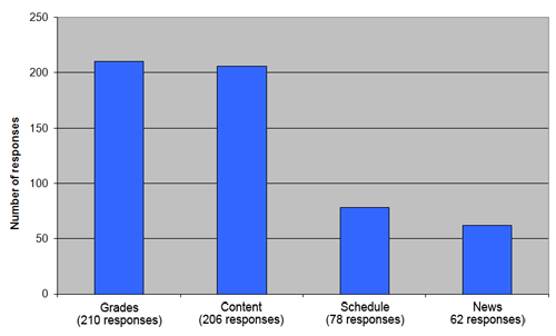
Figure 1. ICON Areas Acccessed Using Mobile Devices
The categories of Grades, Course Schedules, and News represent information that can be presented in a passive or flat format such that the user accesses information without providing additional input or interaction.29 The Content category includes PDF and Word documents — larger and denser information to process than grades and course schedules. This suggests that while flat information is valued, ICON users also want access to denser content using the mobile web.
University libraries use the mobile web to provide information access and delivery. The University of Cambridge in the United Kingdom has an ongoing research project examining the role of libraries and digital tools including the mobile web. Figure 2 shows services identified by their library patrons as most useful to access using mobile phones.30
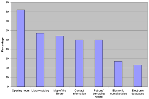
Figure 2. Resources and Services Most Useful to Access Using a Smartphone
The categories of Opening Hours, Map of the Library, and Contact Information represent flat information that can be delivered passively. However, the Library Catalog, Patron's Borrowing Record, and Electronic Databases require active interaction and exchange of information between users and the library. Users seem to want access to information just as if they were using a full web-capable desktop or laptop computer. This appears to contradict the analog-digital distinction.
University of Cambridge users ranked accessing electronic databases and electronic journals in the lowest quartile as desired resources. The researchers pointed out that when this survey was conducted, respondents used their phones primarily for calls and text messages.31 Reasons given included users having first-generation smartphones with limited display screens, the high cost of smartphone data plans, and the fact that iPhones, Androids, and other larger screen smartphones were relatively new to the British market at that time.32
The Kent State University library conducted focus groups in spring 2009 to determine what functions their users wanted to access using smartphones.33 Participants wanted access to research databases to begin their research, to see what was available, and to download citations for later use. Users wanted the ability to access course reserve materials such as PDF documents, along with access to their borrowing records. They also expressed interest in having a map of the building, including call number locations, as well as being able to contact a librarian using their smartphones.
Participants in both the University of Cambridge and Kent State University studies wanted mobile web access to location information, patron-borrowing records, and the library catalog. Where Cambridge University users placed accessing electronic databases and electronic journals in the lower quartile, the Kent State users indicated these were the most desired resources, even if not formatted for the mobile web.34 The reasons for these diametrically opposed findings are not clear. The University of Cambridge users had mostly first-generation smartphones at the time of their study, while the Kent State University users had access to third-generation smartphones and presumably better mobile web access. Since the Cambridge study was done at least one year earlier than the Kent State study, these findings may represent a normal evolution in accessing the mobile web as technology improves. This highlights the importance of finding out which mobile web functions users at each institution value and need.
Access to library catalogs and, in the case of Kent State users, databases for conducting research, suggest an analog orientation toward the mobile web. However, comments from the Kent State focus groups clearly indicate a digital orientation when using the mobile web for research. One user stated, "Let's say if we get an assignment, if I'm in a car or something, I would definitely search stuff and maybe find the websites and save them; that way I could later go back to them..."35 Another user explained, "If I want to know do they have that, just a really quick lookup in the catalog or the journal finder. In a database, I wouldn't do extensive playing around with the source."36 The "research" being discussed by these two respondents consisted of checking whether information existed that would meet their needs. The information is decontextualized and separate from an analog process of information seeking. The focus group respondents indicated they would use their laptops or full-sized PCs to do the sustained research associated with the analog approach.
The limited number of studies on universities, their libraries, and the mobile web suggests a need for further research. Underscoring this need is the difference in how users in these two studies valued access to resources. The next two sections report on development of the mobile web by large universities and their libraries in the United States and Canada.
Selecting the Universities
Research-intensive universities such as MIT and Stanford University have been innovators in mobile web development. This study targeted research universities in the expectation that they are most likely to have mobile web presences given their size and access to resources. Their associated libraries are included because libraries have often been at the forefront of technology adoption. The 111 English-speaking members of the Association of Research Libraries (ARL) were selected for this study. The ARL consists of 124 libraries located mostly within research-intensive universities in the United States and Canada along with a few state and public libraries.37
University Mobile Websites
The websites of the 111 ARL member universities and their libraries were examined for signs of a mobile web presence.38 Mobile websites were found at 39 universities, either for the university or for the university's library (see "Methods"). Figure 3 identifies the distribution of mobile websites across universities and their libraries.
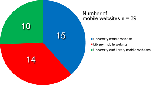
Figure 3. Number of University and Library Mobile Websites
A university-wide mobile website was found at 15 schools, excluding their libraries, while 14 schools had mobile websites for only their libraries. Another 10 schools provided separate mobile websites for the university and its library. The 25 university mobile websites were examined for the functions immediately available on the home page of each site, with the results presented in Table 1.
Table 1. Functions on University Mobile Websites*
| Function/Service | Number of Sites with Function/Service | Percentage of sites with Function/Service |
| Events Calendar | 18 | 72% |
| Directory | 18 | 72% |
| News | 17 | 68% |
| Campus Maps | 16 | 64% |
| Videos | 14 | 56% |
| Sports | 12 | 48% |
| Images/Photos | 9 | 36% |
| Services | 7 | 28% |
| Course Catalog | 7 | 28% |
| Bus routes and Schedules | 6 | 24% |
| Accessories | 5 | 20% |
| Student's Schedule | 4 | 16% |
| Contact Us | 4 | 16% |
| Campus Alerts | 4 | 16% |
| Weather | 3 | 12% |
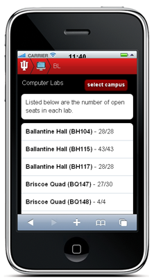
| Available Seats in Computer Labs | 2 | 8% |
| Dining Choices and Locations | 2 | 8% |
| Classified Ads | 2 | 8% |
| Website Links | 1 | 4% |
| Student Cash Services | 1 | 4% |
| Blog | 1 | 4% |
| iTunes University | 1 | 4% |
* N = 25
Because users of the mobile web want and need quick access, functions not immediately available from the home page were excluded from these results. For instance, some universities put bus route schedules or information under another link from the home page, so they were excluded from the list.
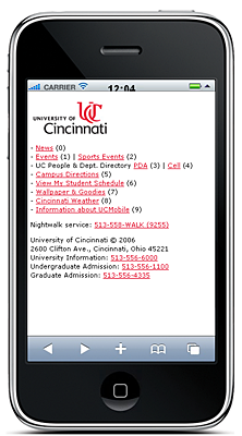
Several categories need explication. The Accessories category included features such as downloadable wallpaper or images for a smartphone, puzzles, and university fight songs.39 Services included a variety of offerings such as a night escort service for students' safety40 and recreation opportunities available on campus.41 The Videos category often contained links to YouTube or university-hosted videos. Some universities provided real-time webcam images of areas such as food courts or computer labs so that users could see whether the site was crowded.42
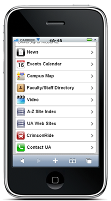
Most of the 22 different categories consist of flat information that is accessed passively, requiring no user input. The four categories most commonly found on university mobile websites — Events Calendar, Directory, News, and Campus Maps — are examples of flat information that is useful for the entire university community and that can be provided easily at low cost.
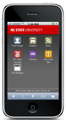
Some of the categories on university mobile websites have the potential to be dynamic (real-time updating of information) and interactive (incorporating user input). Many campus maps are searchable by building name,43 and the seven mobile websites with course catalogs allow searching by course name or subject.44 However, none of the catalog apps allow students to register online for classes. Adding such interactive features is a logical next step in the growth and functionality of university mobile websites. Bus route apps provide interactivity that makes full use of smartphone features such as GPS. MIT and the University of North Carolina at Chapel Hill provide real-time GPS locations of campus buses using the NextBus service. North Carolina State University and the University of Alabama use a competing GPS system, Translocation. Useful transportation information can also be provided using a series of flat menus with static information for individual routes, as done by Indiana University.45
Figure 4 lists the most popular apps on MIT's mobile web during a six-month period in 2009.46
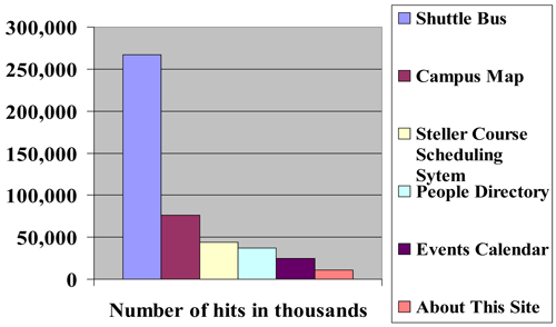
Figure 4. MIT Mobile Website Hits
The Shuttle Bus Schedule was the most accessed app with 3.5 times more hits than the next most popular app, the Campus Map. This is not surprising given the size of the MIT campus and the variability of Boston's weather. The thousands of hits on the Campus Map, People Directory, and Events Calendar apps on the MIT site reflect the general popularity of these apps on many university mobile websites.
The Steller Course Schedule System used at MIT is the third most popular app on the MIT site. The Steller app differs from other popular MIT apps in being student-centric. A closer examination of the categories in Table 1 shows that student-centric services appear in five categories: Course Catalog, Student's Schedules, Available Seats in Computer Labs, Student Cash Services, and iTunes U. A Course Catalog app was found on only seven university mobile web sites (28 percent) and consists of a flat presentation of class schedules. The Student's Schedule app appears on only four mobile websites (16 percent) including MIT's. These results suggest the majority of university mobile websites do not yet strongly support student-centric services even though students are the most likely users of the mobile web.
Library Mobile Websites
Universities and their libraries have multiple options in terms of creating their mobile websites (see Mobile Web Resources). Table 2 lists the functions located on the 24 library mobile web home pages examined in this study.
Table 2. Functions on Library Mobile Websites*
| Function/Service | No. of Library Sites Using (Percentage) |
| Library Hours | 18 (75%) |
| Library Directory | 16 (67%) |
| Library Catalog | 16 (67%) |
| Contact Us | 12 (50%) |
| Main Library Website | 10 (42%) |
| Databases | 8 (33%) |
| "Ask a Librarian" | 6 (25%) |
| Library News & Events | 6 (25%) |
| Renew Materials | 5 (21%) |
| Library Staff Directory | 5 (21%) |
| My Account/Patron Information | 5 (21%) |
| Computer Availability | 2 (8%) |
| Floor Plans/Maps | 2 (8%) |
| Proxy Server Access | 1 (4%) |
| Google Scholar | 1 (4%) |
| Loan Periods | 1 (4%) |
| Reserve Study Rooms | 1 (4%) |
| Full Text Article Finder | 1 (4%) |
| New Books | 1 (4%) |
| Webcams | 1 (4%) |
| Podcasts | 1 (4%) |
* N = 24
Access to Library Hours, Library Directories that provide the address and location of all campus libraries, and the Library Catalog were the most common functions on library mobile websites. The mobile web at the University of Texas Libraries includes these functions in the first three links, with library hours found in the Contact/Visit Us link (see Figure 5).
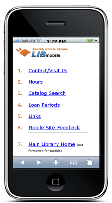
Figure 5. University of Texas Library Mobile Website
The Loan Periods section consists of flat information. The Links section provides connections to the University of Texas mobile web, the Google mobile website, and Google Books for mobile devices.
Users' desire for these common functions was noted in both the Cambridge and Kent State University library surveys. Additional functions such as My Account/Patron Information and Floor Plans/Maps with call number locations were also desired, yet appear on only five and two library mobile websites, respectively. While My Account/Patron Information is an interactive app, library Floor Plans/Maps can be presented in a flat manner. The Rice University Library mobile website includes a very detailed yet user-friendly floor map to help patrons locate materials within the book stacks (see Figure 6).
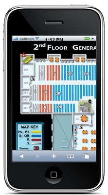
Figure 6. Rice University Library 2d Floor Map
Offices, furniture, and shelves are clearly marked and help the user pinpoint locations. Putting the first two letters of the call numbers on the shelf ranges allow users to move quickly to the section where their books are located. Users can scroll through the map easily to view the entire floor area as needed. The infrequent listing of desired services such as Account/Patron Information and Floor Plans/Maps on library mobile websites suggests an opportunity to align user needs with services.
Links to online databases, identified in the Kent State study as highly desired, were provided by eight libraries on their mobile websites. Six of these libraries identified their databases as having mobile web-optimized interfaces, as illustrated by the University of Nebraska at Lincoln (see Figure 7) and the University of North Carolina (see Figure 8) library mobile websites.
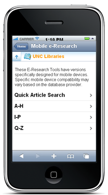
Figure 7. University of Nebraska at Lincoln Library Database Page
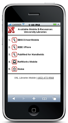
Figure 8. University of North Carolina Library Database Page
The University of Nebraska mobile website provides access to a basic assortment of databases that cover the needs of patrons doing general research (EBSCOhost Mobile), technology research (IEEE Xplore), and medical research (PubMed). Citation support is available through RefWorks Mobile. This assortment of mobile web-optimized databases, although limited, meets the needs of patrons taking a quick look to see if research is available that will support their information needs. The University of North Carolina has an extensive offering of mobile-enabled databases organized into an A-Z list. As more database vendors make their offerings mobile web friendly, libraries will be able to expand their database services and provide interactive information at minimal cost while further aligning their mobile websites with the needs of their patrons.
Discussion
The mobile web is ubiquitous and digital in orientation. The features that make it ubiquitous, such as instant access anywhere, smartphone portability, and increasingly sophisticated apps, make it useful for universities, libraries, and users. These features also require close attention to issues of mobile web design (see Design Issues).
The digital orientation of the mobile web has interesting ramifications. People appear to be ambidextrous in their use of digital and analog orientations, selecting the orientation that makes sense given their physical situation and information needs. In particular, people seem to be orienting themselves before expending energy in longer term analog processes. This raises the following questions:
- If people are ambidextrous in how they use digital and analog orientations:
- What conditions favor using one orientation over the other?
- When doing research, is a digital orientation used first followed by an analog orientation?
- Are we creating digital dependencies or over-reliance on prepackaged information through apps or search engine results with reduced content?
New devices such as Apple's iPad challenge the digital orientation associated with smartphones because users can easily perform activities on the iPad using either a digital or analog orientation. Further research on the tensions between digital and analog orientations is needed to understand the impact of the mobile web.
Student-Centric, Interactive Apps
Universities need to identify and provide more student-centric services on their mobile websites. Many student centric services are best achieved using interactive information. Since interactive services are more complex and costly to develop then passive services, universities can identify student-centric information that can be supplied initially using passive or flat formats, such as course catalogs. Interactive components can then be developed later.
Interactive app design provides challenges along with opportunities for universities. Student ID cards, for example, are commonly used for identification, checking out books, and paying for goods and services on and around campus. Students also frequently lose or damage their ID cards. Many ID card functions could be incorporated into students' smartphones, including the student's picture, transcripts, campus cash, etc. Savings in producing and delivering ID cards could offset development costs of the interactive application, as could charging a fee for students who download the ID card app onto their smartphones.
Academic Functions
Education is the primary function of universities, yet few of the functions observed on university mobile websites clearly addressed educational needs. The video category found on 14 university library mobile websites often contained a mix of educational videos and news/entertainment videos. One school provided a link to iTunes University on its mobile website. Universities can and should be doing more in terms of educational links and apps as part of their mobile web development.
Libraries provide some education-focused resources via the mobile web, such as databases and course reserve materials. Libraries often have tutorials or videos providing instruction on how to use databases, how to do basic research, and how to cite articles using standard citation formats. Many of these educational items could be delivered via the mobile web so that students doing research on a PC could access this information using their smartphones without interrupting their research process. Issues such as instructional design for the mobile web are avenues for further research.
Accessibility
Universities and their libraries have yet to address mobile web access for people with disabilities. Providing access will require creativity and a synergy between schools and the commercial/open-source sectors. Voice-activated menu systems are already incorporated into many smartphones to enable hands-free use, and database vendors are making the content of some articles available in audio formats. As a result, access to the visually oriented mobile web does not have to be limited to the visual. Other access issues can also be addressed through creative synergies.
Conclusion
This study provided an initial look at how universities and their libraries are moving toward the mobile web. While universities and their libraries engage in the technical aspects of developing and launching mobile websites, higher order questions highlighted by the digital-analog tension remain to be addressed:
- Is a digital literacy developing alongside mobile web development such that it can be measured, taught, and used?
- How does a digital orientation influence our thinking and our behaviors over time?
Addressing epistemological questions such as these is important to understanding mobile web development. The ecology of the mobile web, like all ecologies, is constantly changing. What makes the mobile web different and interesting is its rate of evolution. Studies like the one reported here become more valuable when further analysis is done over time, adding to our comprehension of the changes.
Acknowledgments
The author is grateful to Carol Leibiger of the University of South Dakota and Andrew Yu of the Massachusetts Institute of Technology for discussions that led to the writing of this article. Thank you as well to the editor, Nancy Hays, and her team of anonymous reviewers whose suggestions made this work more focused and relevant. This research was supported in part through a travel grant from the Center for Teaching and Learning at the University of South Dakota.
- Bob Albrecht and Judith A. Pirani, "Massachusetts Institute of Technology: Transforming the Campus Experience with the MIT Mobile Web," (Case Study 3), Boulder, CO: EDUCAUSE Center for Analysis and Research, 2009, available from http://www.educause.edu/ecar/; and Josh Quittner, "Can iStanford Take on Facebook Mobile?" Time (January 01, 2009).
- "Duke Introduces New Applications for Mobile Devices," States News Service, (March 4, 2009), retrieved from Lexis-Nexis Academic; "App Connects iPhone Users with Latest Penn State News," States News Service (August 6, 2009), retrieved from Lexis-Nexis Academic; "UW's New Tools for iPhones, Mobile Devices Launched today," States News Service (September 3, 2009), retrieved from Lexis-Nexis Academic; Briant Robey, "New N. C. State Mobile Site Offers Utility, Convenience," University Wire (September 16, 2009), North Carolina State University, retrieved from Lexis-Nexis Academic; States News Service, "Texas A&M Introduces Mobie Web Site for Smart Phone Users," States News Service (February 9, 2010), retrieved from Lexis-Nexis Academic.
- John Horrigon, "Wireless Internet Use," Pew Internet and American Life Project (July 2009).
- "Mobile Phone Shipments Rebound to Double Digit Growth in Fourth Quarter, According to IDC," International Data Group press release (January 28, 2010).
- Ellyssa Kroski, "On The Move With the Mobile Web: Libraries and Mobile Technologies," Library Technology Reports, vol. 4, no. 5 (July 2008), pp. 5-9.
- Alexandre Mars, "Importing Mobile Marketing Tools," Brandweek, vol. 51, no. 7 (2010), p. 17.
- Richard Oppenheim, "Is That a Computer in Your Pocket? The Incredibly Shrinking Computer," Searcher, vol. 17, no. 2 (2009), pp. 42-54.
- Sujan Shrestha, "Mobile Web Browsing: Usability Study," Proceedings of the 4th International Conference on Mobile Technology Applications and Systems, September 10-12, 2007, Singapore, pp. 187-194.
- Anne Kaikkonen, "Full or Tailored Mobile Web — Where and How Do People Browse on Their Mobiles?" International Conference on Mobile Technology, Applications, & Systems, September 10-12, 2008, Taiwan, ACM 978-1-60558-089-0.
- Mark Weiser, "The Computer for the 21st Century," Scientific American, vol. 265, no. 3 (September 1991), pp. 94-105.
- Mark Weiser, "Some Computer Science Issues in Ubiquitous Computing," Communications of the ACM, vol. 36, no. 7 (July, 1993), pp. 75-84.
- George W. Fitzmaurice, "Situated Information Spaces and Spatially Aware Palmtop Computers," Communications of the ACM, vol. 36, no. 7 (July 1993), pp. 39-49.
- "App Store Metrics," 148Apps.biz (as of February 9, 2010).
- Alan Livingston, "Smartphones and Other Mobile Devices: The Swiss Army Knives of the 21st Century," EDUCAUSE Quarterly, vol. 27, no. 2 (2004), pp. 46-52.
- Frederick H. Lowe, "MC's Mobile ATM Hunter Catches On," American Banker, vol. 175, no. F311 (2010), p. 7.
- United Services Automobile Association, Geico, and American Family Insurance are examples of companies with applications available from the iTunes Store.
- Ron Panko, "Virtual Office Updated: Are Smartphone Applications Any Way for Insurance Sales Forces to Conduct Business?" Best's Review, (February 2010), pp. 51-53.
- "Boom Seen Coming for Mobile Commerce," Women's Wear Daily, vol. 199, no. 61 (2010), p. 13.
- Emily B. York, "Ordering Pizza Hut From Your Facebook Page? It's on the Way," Advertizing Age, vol. 79, no. 42 (2008), p. 50.
- The tensions emerged out of the discussions on cybernetics in the 1940s and 1950s. For a nice discussion of these issues, see Dominic Boyer, "Digital Expertise in Online Journalism (and Anthropology)," Anthropological Quarterly, vol. 83, no. 1 (2010), pp. 73-96.
- Peter Tarasewich, Jun Gong, Fiona Fui-Hoon Nah, and David DeWester, "Mobile Interaction Design: Integrating Individual and Organizational Perspectives," Information Knowledge Systems Management, vol. 7 (2008), pp. 121-144.
- Kaikkonen, "Full or Tailored Mobile Web."
- Ibid.
- Inseong Lee, Jaesoo Kim, and Jinwoo Kim, "Use Contexts for the Mobile Internet: A Longitudinal Study Monitoring Actual Use of Mobile Internet Services," International Journal of Human-Computer Interaction, vol. 18, no. 3 (2005), pp. 269-292.
- Megan K. Fox, "Mobile Delivery: Information Any," Netconnect, (Fall 2008), pp. 2-5.
- Albrecht and Pirani, "Massachusetts Institute of Technology."
- Ibid, p. 6.
- University of Iowa, "ICON Mobile Device Use Survey Results."
- Lee, Kim, and Kim, "Use Contexts for the Mobile Internet."
- Keren Mills, "M-Libraries: Information Use on the Move," Arcadia Program, University of Cambridge.
- Ibid, p. 9.
- Ibid, p. 3.
- Jamie Seeholzer and Joeseph A. Salem, "Library on the Go: A Focus Group Study of the Mobile Web and the Academic Library," ACRL preprints (December 21, 2009).
- Ibid, p.9.
- Ibid, p. 8.
- Ibid, p. 10.
- "ARL Member Libraries," Association of Research Libraries, accessed February 9, 2010.
- Ibid.
- See, for example, the University of Texas mobile website or the iPhone app available from the Apple iTunes store.
- See the University of Cincinnati mobile web home page.
- See University of Saskatchewan app available from the Apple iTunes store.
- See the University of Saskatchewan app available from the Apple iTunes store.
- See the mobile websites for Duke University, the University of Washington, MIT, University of Cincinnati, and Indiana University.
- See Duke University, MIT, Texas A&M, Indiana University, University of Washington, and the Texas Tech app and Stanford University app at the Apple iTunes store.
- See the Indiana University mobile website and click on Bus Schedules.
- Andrew Yu, "Mobile Computing: Lessons learned," panel discussion for "Reaching Consumers through Nontraditional Methods: What Can WorldCat Do for You?" at the American Library Association Midwinter Meeting in Boston, MA (January 2010).
© 2010 Alan W. Aldrich. The text of this article is licensed under the The text of this article is licensed under the Creative Commons Attribution-Noncommercial-No Derivative Works 3.0 license..

