
"We sit on a ton of data and just don't use it," said Chris Handley, CIO at Stanford University, in reference to the university's databases supporting operations. Similarly, in 2002, the Massachusetts Institute of Technology also saw a glaring need for meaningful operational data when a visiting committee reviewed its IT services. The committee lamented, "The absence of detailed cost data for IT activities and useful benchmark data from peer institutions … became an obstacle to completing the full scope of the review."1 Broadly, both universities needed data about costs, customer satisfaction, process performance, project performance, and employee performance and satisfaction.
Budget pressures compel all of us in higher education to demonstrate value in IT investments, using both quantitative and qualitative information. Like many institutions, however, both Stanford and MIT have found themselves forced to rely more on anecdotes than on management information to guide decisions. In response, MIT and Stanford partnered to develop meaningful comparative data and to understand each other's IT services and performance. In essence, after more than a decade of significant IT investments, both campuses asked, "How effectively are we performing? How do we compare to other universities and by what measures? How can we use our IT systems to help us manage ourselves better?"
When beginning this effort, both institutions knew that several aspects of the project would be critical:
- Define data clearly. This would ensure meaningful "apples to apples" comparisons.
- Capture costs consistently for the services under study. Complex accounting structures in most university settings hampered previous benchmarking efforts, obscuring valid cost comparisons. We wanted to overcome this problem.
- Understand each other's processes in depth. To interpret comparative data, we needed to understand the factors behind the performance.
- Tackle issues of a manageable scope. Rather than develop broad metrics for IT overall, we sought metrics to inform decisions and compel action. The area of study needed to be broad reaching and visible, yet also well contained and data rich. These criteria led to the selection of IT help-desk services as the first area of study.
As a result of an 18-month effort, MIT and Stanford have learned valuable lessons about
- developing the methodology to conduct these comparisons;
- defining specific metrics for IT help-desk services;
- creating a "dashboard" chart that summarizes important performance indicators at a glance, much like an airplane's cockpit monitors; and
- using data to drive cultural change in the management of a university.
The efforts have been rewarded well. Each campus has seen
- process improvements, such as reduced hand-offs and broader range of topics supported;
- new abilities to handle spikes in workload due to crises (such as viruses) or plans (such as new system rollouts); and
- marked improvement in performance, such as an increased rate of cases resolved on first contact and number of cases handled per employee.
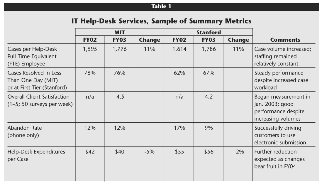
Table 1 provides a few summary indicators comparing performance between October 2002 and October 2003. Despite significant increases in customer requests for help, performance has remained relatively steady, without additional staff. We expect to continue to increase the range of services provided by help desk staff through greater consolidation and centralization and likely will reduce staffing requirements—and thus costs—over time. More results and extensive project documentation can be found at <http://web.mit.edu/is/about/benchmarking>.
Click image for larger view.
One of the greatest outcomes of the collaborative project has been a fundamental shift in the sands of management culture. Administrators and senior officers are requiring that relevant, useful data be part of management decision making and assessment. We are shifting from management by personality and anecdote to management by fact.
A Methodology: "Deep" Benchmarking
To shape this effort, we began with a typical benchmarking approach. We modified our efforts by digging deeper, sharing more intensely, and working much more iteratively to develop our shared metrics. Previous benchmarking efforts in higher education typically have focused on higher-level financial indicators or readily available data, including, for example, the National Association of College and University Business Officers (NACUBO) benchmarking study in the early 1990s or the new EDUCAUSE Core Data Service. These studies are extremely valuable to outline broad issues, and they identify potential areas for further study. They also, of course, raise questions about "apples to apples" comparisons as well as how to act upon the data to make improvements. Compared to these efforts, our work seemed to dig deeper and be more applicable directly to line operations; "deep" benchmarking evolved as the appropriate term.
A Good Fit for Higher Education
Benchmarking should be a natural act given the culture of higher education. Long-term, highly collaborative relationships tend to develop across institutions. Among trusted peers, data often are shared, site visits are welcomed, and, of course, learning and innovation are core values.
We considered seeking more partners or even a "best practice" partner, perhaps from industry. Instead, we followed the advice of benchmarking author Jeffrey Alstete, who said, "Same speed partnerships tend to return the highest value, and projects often fail when institutions reach for 'too much, too soon.'"2 We did pursue some conversations with corporate entities and did glean process-improvement and data-analysis ideas. Corporate groups were not willing to share key financial data, however, and even operational data were fairly guarded.
Stanford and MIT already had collaborated on a number of issues over the previous 15 years. MIT's CIO served on a visiting committee at Stanford. MIT's chief business officer spent much of his career in California. In the mid-1990s, the IT leadership at Stanford and MIT were part of a small group of institutions that met for information sharing. By working with a trusted peer, we were able to plant seeds and allow new ideas to evolve over time as the team and the organization learned and were ready for more.
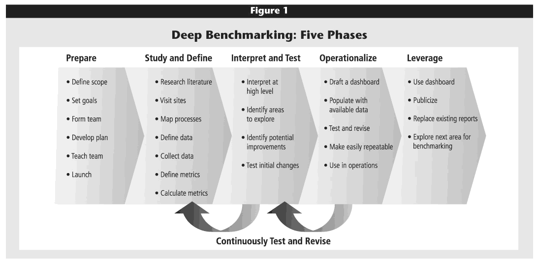
Five Iterative Phases
As depicted in Figure 1, our bicoastal alliance followed a five-phase approach to learning from each other and developing reasonable metrics. The phases were straightforward; the iterative nature drove success. Groundwork in the first two phases was typical for any benchmarking project and will be described only briefly below. The latter three phases produced the core data that informed line managers and enabled learning. The following sections will visit each phase in turn.
Click image for larger view.
Phase 1. Prepare
The first step, preparation, involves setting the scope of the work and forming a team to carry it out.
Setting the Scope
With the Stanford-MIT partnership commitment and methodology in hand, we began defining scope and forming a team. Instead of a cursory review of a wide range of IT services, both institutions agreed to a thorough review in a targeted area—hence "deep" benchmarking. The objective was to understand in detail the services offered, systems, business processes, data, staffing, and management infrastructure. We wanted to learn enough to make specific, real changes in the operations, staffing, or systems. The first area selected for study was IT help-desk services—full of data, highly visible, relatively self-contained, and yet the critical "client-facing" component of most aspects of the overall IT organization.
Team Members and Their Time
Based on this scope, key IT and help-desk staff were selected for a team (see the sidebar "Team Members for Each Campus). We did not include a customer advisory board, which might have provided both content suggestions and additional publicity. Looking back, we could have included frontline staff in more iterative discussions about progress, results, or potential metrics in order to accelerate their familiarity with and buy-in to the concepts. Because we were "learning by doing" in the early phases of the project, we opted for a more supportive environment for team members where we could experiment and make mid-course corrections. As we now engage more of the operational activities for benchmarking, sharing more with customers and involving more frontline staff will be natural next steps.
The most intense project work was scattered intermittently over a four-month period. Team members invested roughly 15 percent of their time on the project, with the financial and data analysts spending more, roughly 30–75 percent during peak data-collection periods. Each team had at least one member with a real thirst for numbers and interpretation of them. Having an IT generalist on each team helped solve problems and maintain a broader context.
The critical role of project manager (half-time) supported the joint effort for both campuses and provided invaluable focus, scheduling support, strategic perspective, and key links to sponsors. The project manager was a funded position, a consultant with experience in higher education, operations, and benchmarking.
Beginning in phases 4 and 5, the project shifted away from intense early activity and became more incorporated into the routine management of the help desk, thus diminishing the time commitments for team members. Finally, the CIO and the COO or CFO on each campus jointly sponsored the project, with extensive briefings every three to four months. These lengthy, detailed briefings were extremely important to keeping the project integrated with the senior officers' overall vision and organizational strategy. The briefings also created key project deadlines and spurred progress.
Many other projects spawned from this first benchmarking effort, such as a joint client-satisfaction survey, desktop computer procurement discussions, and discussions to improve telecommunications on campus. These were spurred by involvement of senior officers whose sponsorship sent a clear message of priority and accountability across the whole organization. A cross-institutional project, one that challenges culture by introducing measurement, cannot be done on the margin without such high-level, engaged sponsorship.
Phase 2. Study and Define
A few important choices proved especially beneficial in the second phase.
Site Visits
We planned site visits early in the project. All team members gained tremendous knowledge from observing each other's operations in action and asking lots of questions, right on the spot. The benefits were nearly immediate without an onerous investment of time. Everyone enjoyed a chance to see how others work. MIT project team member Oliver Thomas said, "Going there and being in the mix was very, very different. It helped me understand things I hadn't understood before. It sparked ideas." The visits also created project and task deadlines.
Process Maps and Data Definition
As follow-up to the visits, we created detailed process maps for each campus's workflows. These maps forced us to understand very clearly our own work and facilitated comparative discussions.
Just as important, we developed detailed data definitions during the initial, in-person visits. We rigorously identified likely "desired data" versus "available data" and precisely defined each element. For example, we defined what constitutes a "case" (a request for help, also called a ticket), "touch time" (minutes spent working on a case), or "elapsed time" (total time to resolve a case). Note that benchmarking partners need not have identical information systems. Stanford uses Remedy; MIT uses home-grown CaseTracker. It's the data, not the systems, that matter. Eventually, we published a glossary of data definitions to help ensure accurate interpretations for each partner. MIT's and Stanford's Help Desk Benchmarking glossary is available on our project Web site.
The process maps and data definitions were, of course, tedious and time consuming, but they served as the foundation for the entire project. They were essential in developing "apples to apples" comparisons, which is the only basis for legitimate metrics and for eventual acceptance by staff and management.
Just Do It
Eventually we found we could not wait for perfect definitions and perfect data. We collected data based on the initial definitions, which meant running systems queries, developing spreadsheet models, and generating reports. We then compared data, discovered errors or misunderstandings, redefined, and collected data again. Six months into the project, we discovered an error in the method to count "cases"—some cases were routinely "double created" when follow-up administrative actions were recorded. Without the repeated iterations, the error would not have surfaced.
We routinely had to trash data that did not prove actionable. Rough data, even guesses, combined with good conversations, served our purposes better than refined but long-delayed data.
This work was straightforward, albeit detailed and labor intensive. For the next three phases, more strategy and creativity came into play. A few examples from our IT help-desk study will illustrate the use of specific measures and sample interpretations.
Phase 3. Assess Metrics
Phase 2 largely focused on simply understanding what happened in both partners' shops. As the team began to consider metrics, the focus naturally shifted to the future: What is a meaningful way to measure service? By what standards will we hold ourselves accountable? How will the information be used? What data are available now?
A certain tension existed between developing metrics with data that were currently available versus those with data that would be informative but were not then available. We found value in jointly estimating metrics as a starting point for learning and discussions. Measurements also could be very high level and broadly descriptive or, on the contrary, detailed and indicative of specific performance.
Our team considered the value of both types of metrics. Broad indicators are useful when calculated once or twice a year and are better indicators than detailed metrics for executives considering strategy, funding decisions, customer relationships, or staffing plans. Detailed metrics are best when used weekly, or even daily, by line managers. Regardless of the nature of the individual metrics, each must link to overall goals; this linking was the first step in developing a set of metrics.
Link Goals to Metrics
The overall mission of a help desk is to get the client up and running as soon as possible. Against that backdrop, our team settled on seven goals for the IT help desk, as shown in Figure 2. Using a framework from the META Group and from Kaplan and Norton's The Balanced Scorecard,3 we "identified a set of questions that you might ask to help understand whether you are achieving your goals. Many of these questions have answers that can be measured."4 Each campus wanted to assess its own performance over time (longitudinal studies) as well as compare performance across the two institutions. Figure 2 arrays the seven goals and corresponding metrics, most of which will apply to many IT help-desk operations.
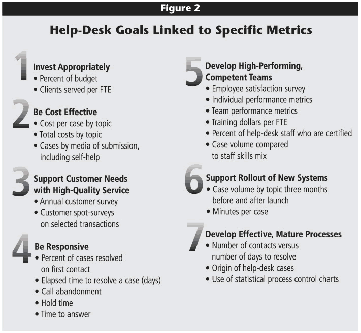
Click image for larger view.
The data to calculate the metrics in Figure 2 were not all immediately obtainable. In fact, many of the most important metrics were only available with systems changes and better record keeping. In this phase, we calculated those metrics that were feasible and then used interpretations to further assess the need for systems modifications or better data entry to enable better management information.
Some of these metrics should be part of broader institutional or strategic IT goals, more akin to a balanced scorecard at a high level. Eventually, we hope that these efforts at an operational level will lay a foundation for our institutions to pursue such strategic measurement efforts.
Calculate Initial Metrics
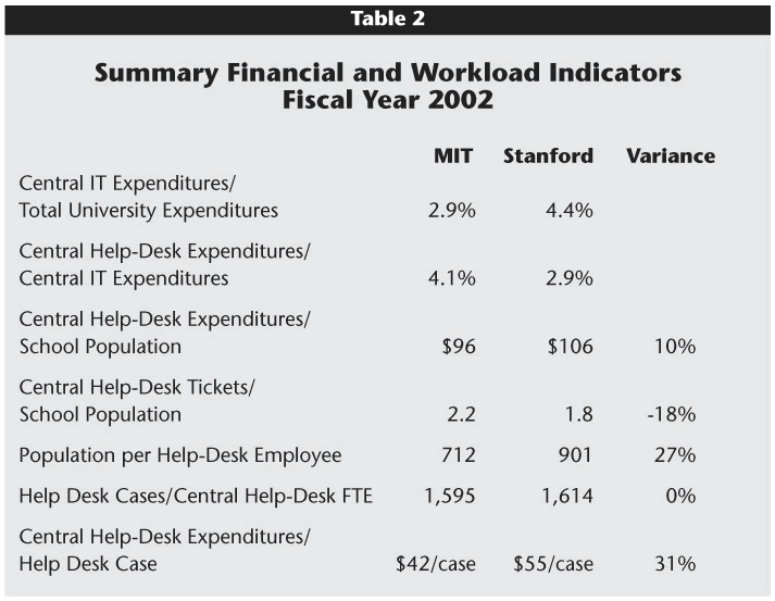
Most benchmarking efforts in higher education have used high-level ratios based on easily available data. They reveal general strengths and weaknesses but not the type of information needed to effect cultural change or to manage people and processes. Similar to other benchmarking studies, this project began, in part, because of a desire for high-level comparative information on appropriate investment levels and resource allocation. Table 2 displays a sampling of such summary financial and workload ratios for Stanford and MIT. The sidebar "Calculating Costs in a University Environment" summarizes our methodology for calculating total help-desk costs.
Click image for larger view.
While provocative, these indicators can be rather superficial. They provoke policy discussions and then simply spark more questions. For instance, data in Table 2 indicated that Stanford invested a greater percentage of its university budget in the central IT function than did MIT; Stanford invested proportionately less of its central IT dollars, however, in the help-desk function.
The data are interesting but, like all high-level metrics, raise immediate questions in two categories:
- Did we define the work and scope similarly?
- Exactly what services and topics are included?
- Exactly what costs are included?
- What IT help services are provided by the central help desk versus distributed departmental IT staff?
- How do customers experience the quality of service?
- How do help-desk staffing levels and competencies compare?
- Why does one campus have more questions per person than another campus?
- What are the major drivers of help-desk workload and cost?
Hence, operationally oriented measures were strongly needed to help answer these questions. When first considering the data in Table 2, we were tempted to refine our historic collection of data. The real value, however, was found in using our incomplete and rough historical data to help us learn what data we should collect in the future. When high-level indicators were linked to other metrics, the information became very useful.
As a next step, another analysis looked at help-desk cases by subject category, such as inquiries related to passwords, hardware, business applications (Oracle, SAP, PeopleSoft), e-mail, or printing, for example. Both MIT and Stanford tracked the total number of cases in 15 mutually-agreed-upon categories and estimated the average cost of processing a case in each category.5
Assess Metrics, Implement Initial Changes
The data raised red flags for each campus, identifying areas for further study. The full set of these charts is available on the project Web site. To demonstrate how such data can provoke change, we present the data for two Stanford case studies—one relating to help for account IDs and the other relating to the support of business applications.
A Case Related to Account IDs. Stanford found that the average cost per case related to an account ID or password was $46, less than the average cost of $55 for all cases. Compared to MIT's cost of $19 for each password or ID case, however, Stanford's figure made us curious. The comparative volume and total cost of these cases then raised further concerns. Account IDs accounted for 23 percent of all help-desk cases at Stanford but just 17 percent at MIT. Stanford's total cost was $210,000, while MIT's was roughly $70,000. As a result of these data, Stanford simplified password reset capabilities and implemented software for self-serve, automated password reset. The investment is expected to pay off in less than a year.
A Case Related to Business Applications. In another example, based on benchmarking data, Stanford radically changed its support for rolling out new business application software. The cost of helping with a business application case at Stanford was $59, approximately equal to the overall average per-case cost of $55. MIT's cost, however, was just $34. More telling, a whopping 39 percent of all Stanford help-desk cases related to business applications compared to just 6 percent at MIT. Stanford's total cost on this topic was $500,000, while MIT's total was less than $50,000. Stanford knew that their numbers were in part the result of rolling out two major new systems; they also believed that support of these systems was handled at too high a level (not the point of first contact), thus increasing costs and wait times. A supplementary analysis also showed spikes in inquiries for 6–10 weeks after each new system rollout.
Thus, for its next large system rollout—Oracle Financial Systems—Stanford created a temporary "extended team" of 10 specially trained staff drafted from other IT areas. The voicemail tree was changed so that customers could immediately choose Oracle-related support, and those calls were routed to the new temporary group. In addition, four staff from the regular help desk rotated through the temporary group to gradually build knowledge and continuity for the main help desk. Senior-level support for this supplementary, albeit temporary, staffing was clinched, in part, by the Table 2 high-level data that showed that Stanford invested less than MIT in help-desk support overall, as well as the analysis showing spikes in activity.
Lessons Learned about Initial Data Interpretation
In both of these examples, no single indicator rang true. Any one variable could be misleading, while the composite view could be quite enlightening. The interrelated nature of the metrics gave rise to a powerful story to motivate important improvements. At MIT in particular, previous Quarterly Reports provided by each IT area, including Help Desk Support, were jammed with metrics, but no story unfolded to compel actions in response to those data. These measures were based on what could be collected and not on what should have been reported. In addition, because they were based on team performance rather than process or function, the measures tended to be highly detailed and not useful for an external audience. Finally, all of these measures were lagging indicators; they assessed past performance. We needed to develop metrics for ongoing management of current operations as the customers experience them—to "operationalize" the use of facts in management.
Phase 4. Operationalize
This project began as a comparison of services, cost, and performance between the two schools, in a traditional sense of benchmarking. Over time, it evolved into the collaborative development of a management tool using carefully defined data, which, of course, also enabled comparisons. We developed a "dashboard" of operations and customer data that gave a composite view of how things currently are working. With these data, managers and staff can alter processes often before problems emerge.
What's in a Dashboard?
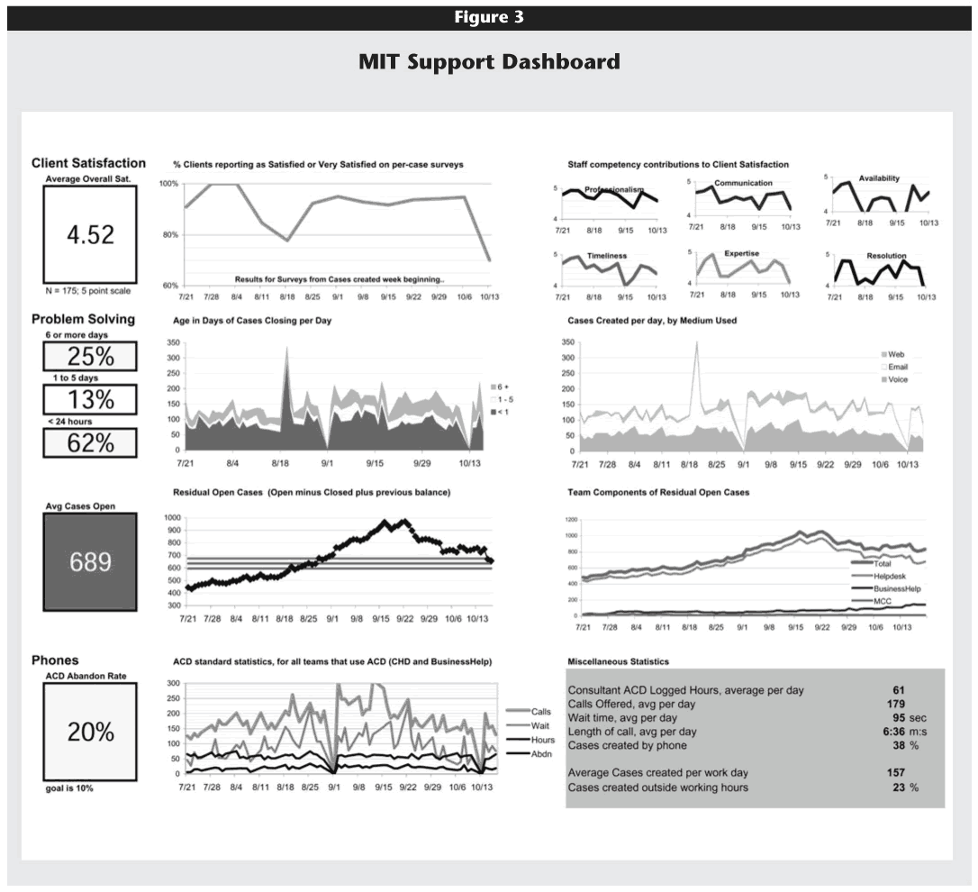
A dashboard summarizes performance on critical dimensions, as determined by the project team and line managers. It's meant to be useful at a glance, highlighting when measured key indicators are operating as expected versus running into problems. Figure 3 presents the first page of MIT's sample dashboard for IT Help Desk Services.
Click image for larger view.
To use the terms from Kaplan and Norton's framework from The Balanced Scorecard, the dashboard presents measures of the customer experience and internal business processes, most of which are trended over time. In the first row, we see various measurements of customer satisfaction. Any response that falls below a "4" triggers management attention. In the remaining rows on the first page of the dashboard, the metrics tie to processes, such as the time to close a case, the media by which a case was submitted, cases remaining open at the end of the day, or call statistics coming through the Automated Call Distribution center. We are currently developing more detailed charts that allow managers to click down from one chart to another with greater detail. Reviewing the charts together, managers can assess performance and determine corrective actions.
One example shown in the dashboard relates to the SoBig virus. Throughout the summer of 2003, the average number of cases created per day at MIT remained relatively steady at 125–130. In mid-August, however, MIT, like many other institutions, experienced serious network attacks. Users of compromised machines created an explosive increase in the number of daily cases, to nearly 200 per day. In response, the MIT Help Desk initiated three actions. First, they established a triage process to address these security cases as a first priority and to provide assistance with other problems only as resources permitted. Second, they recruited other IT personnel to help on a temporary basis. And finally, they negotiated with the Network Security Team to train and quickly authorize two help-desk staff to revalidate users who had been cut off from network access because their computers were infected—a privilege normally tightly held by Network Security. Without specific data substantiating this need, we might not have been able to overcome this hurdle, and the queue would have continued to grow.
Client satisfaction was understandably low during these attacks, as shown in the top row of the dashboard. Clients called the help desk in very high numbers, and, given the severity of the problem, these callers were willing to wait longer for assistance. In the third row of the dashboard, we see that the number of open cases increased as a result of the virus attacks. We quantified that when an event affects a large percentage of the community, it takes a long time to catch up and respond to all open cases. As a result, we are experimenting with different approaches to staffing help-desk activities in those situations.
Developing a Dashboard
Developing a dashboard forces staff and managers to be very clear about which benchmarks are important and useful. We were surprised by how much iteration was required to construct a version that managers wanted to use. The team had to be willing to trash data or charts if they didn't prove actionable. We constantly had to ask the question, "So what?" If nothing can be done in response to the data, then likely it's not worth tracking.
We also developed charts with "control limits," as described in Donald Wheeler's book Understanding Variation: The Key to Managing Chaos.6 Wheeler explained in simple terms how to create charts with upper and lower limits so that, with a glance, one can tell if a process is running normally or having problems. On one of the detailed "click down" charts of the MIT dashboard we saw that, in mid-August, the wait time for phone calls increased beyond the upper boundary of 120 seconds (the average time is normally between 40 and 50 seconds). For two weeks, the wait time was above the upper boundary. The help-desk managers compensated by recruiting other IT staff to the call center to help return the wait time to normal control parameters.
Finally, one of our key insights was the importance of being able to tag data flexibly with topic information (call it metadata) as they move through the process. Predicting how we want to categorize data is often impossible, making it especially important to be able to change and augment that categorization on the fly.
Using a Dashboard
A dashboard is useful as a management and communications tool for many audiences: staff, line managers, senior management, and even customers. Staff and line management can identify problems quickly and clearly, leading to faster resolution. Line managers can engage senior management using summary charts, as opposed to overwhelmingly detailed data. Jointly, they can assess performance and identify areas for potential investment or cost savings, depending on desired service levels. For communications, the dashboard provides a powerful visual representation of work and issues. It can, at a glance, demonstrate to senior administration key impact areas and the need for additional, sometimes temporary, resources. Finally, some charts can even be used with customers to demonstrate improvement over time.
Trying to "operationalize" such charts and metrics requires patience. Team leaders need time to internalize this new perspective. Some thought, "Just because I don't use a chart doesn't mean I'm not using data." This might be true, but that approach to supervision does not scale and raises the question of whether there is too much supervision or not enough. Professional development may be required to enable a new set of management skills and a shift in culture. Others craved even more data and understandably were frustrated by the time needed to develop further systems to track proper and useful data.
Phase 5. Leverage
After a year or so of working on such a project, an institution finds itself in an unusual position: performance is exposed, and it comes time to do something about it.
Reports
First, management—both line managers and senior officers—need to expect that dashboards will replace existing reports. Rather than creating additional new reports, the intent is to create more-valuable, interpretative reports, hopefully with less effort. The charts should be automated and based on reliable, routine data. Such reporting is a seed in the cultural change.
Performance Matters
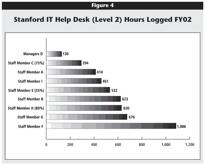
Next, specific corrective actions need to be implemented. Changes were made only a matter of months into the study. One of the first changes was using the metrics directly with staff. For example, Figure 4 shows the hours logged for each Tier 2 help-desk employee during fiscal year 2002 at Stanford. Clearly, employees C, A, and I were logging significantly fewer hours (294, 414, and 461) than their team members. These data had to be considered along with data on successful resolution of cases and customer satisfaction, of course. The combination of these metrics raised significant questions regarding performance. Never before had such data been assembled, again reflecting a major cultural change. Stanford shared the data at staff meetings. Managers were present at the meetings but did not make any comments. The intent was to share data as opposed to point fingers. Staff raised issues and questions among their peers. The discussions initially caused fear, but eventually produced positive behavioral change and became a component in performance management.
Click image for larger view.
Interestingly, the MIT culture is not yet ready for this evaluation of individuals. At MIT, such metrics are reviewed in aggregate at the team level, but individual performance is not reported, with one notable exception. For the MIT student help desk (staffed entirely by students and serving only students), the data are generated and shared, but only for peer-to-peer review. Managers, who are regular staff professionals and not students, do not see the data.
Organizational Changes
Both MIT and Stanford successfully tested small changes during the course of the project, but larger changes also are needed, some requiring funding. For MIT this has meant defining the need for better systems and tools. In response, MIT is replacing its homegrown case-management system with an open-source tool, Request Tracker (RT). RT also will provide the beginnings of a knowledge database, serving as a resource for help-desk staff and potentially as a tool for self-help queries for customers.
MIT consolidated the four components of its existing help-desk operations into one "First Contact Center" (FCC). Help-related support for the telephone system also is being integrated into the FCC. The FCC has brought in subject-matter experts from Tier 3 IT support staff to train frontline staff and build stronger relationships. The goal is to resolve as much as possible upon the first client contact, without having to queue the customer for additional support.
Stanford also was fortunate to have a CIO committed to this kind of change and motivated by the benchmark information. Currently, many IT consulting staff sit out in the academic departments and provide desktop support—an expensive model. Discussions have begun to further centralize Stanford's help-desk operations. Naturally, this is a highly sensitive topic, brought to the fore with benchmarking data.
Stanford recognized the need to further consolidate all client-facing groups within the central IT department and implemented a number of aggressive changes:
- Tier 1 and Tier 2 help desks have been consolidated under one director.
- Distributed help (fee-based desktop support) was also moved under this director.
- Three other groups with high client interaction were moved into the help-desk area: reporting, client relations, and business applications, including 70 programmers who also provide technical support.
- Finally, additional help-related services are being moved from other departments into the ITSS help desk. By calling the single 5-HELP phone number, clients can now obtain help for telecom, billing, badge cards, or long-distance calling authorization.
Closer coordination of these client help functions should improve efficiency, cost, and service.
Interestingly, before this benchmarking project, each institution had chosen to centralize various aspects of service in different ways. In each instance, the situation with greater centralization tended to show economies of scale both in terms of cost and better service. Both institutions learned that, to the extent possible, as many topics and calls as possible should be channeled to the first-contact help-desk agents in order to have less confusion, fewer hand-offs, faster case resolution, and lower costs.
Lastly, leveraging this work means extending it to other areas, certainly in the central IT department and ideally across other areas of administration as well. For MIT and Stanford, the next area benchmarked likely will be the support of enterprise resource planning (ERP) systems.
Lessons Learned
During the course of this project, a number of lessons became evident, as summarized below.
Working with a Partner
With 80 universities within a 10-mile radius of MIT, a partnership with easier logistics certainly could have been formed. A partnership, however, is based far more on relevance and relationships than geography. The collaborative atmosphere has many ancillary benefits—the relationships enable extensive cross-institutional learning and permit the participants to talk openly and safely about their work.
Granted, our best work was done in person during several multi-day, on-site sessions every three to four months, but technology did help overcome geography throughout the remainder of the project. Audio teleconferences were effective with two or three participants but not the full team. Videoconferences worked very well for full team discussions. Scheduling longer videoconferences also helped us dig deeper on issues, usually two hours at a time approximately every two weeks during the prime work period of the project. A team e-mail list helped us stay on track with action items, detailed follow-up questions, and document reviews.
Hurdles That Were
Several issues that came up were surprisingly difficult to address. First, the data definitions were very difficult. We thought we understood each other's terms and operations, but then would find wildly different data results that prompted questions. Usually, the confusion stemmed from different interpretations of definitions. This problem may be particularly unique for higher education. Unlike business, where revenues, costs, and profits make the focus very clear, the demands in higher education have more dimensions, requiring more clarification.
Capturing costs, as described in the sidebar "Calculating Costs," was also very time consuming. Stanford's IT financial structure is functionally oriented, while MIT's is process oriented, meaning that the data were tracked very differently. Including the IT financial analysts as team members was extremely important to help normalize the differences. Ultimately, running repeated data cycles helped resolve discrepancies.
Fully anticipating data needs and uses was nearly impossible. Iterative design and testing were important in developing useful tools and information. Flexible tagging is also an important design element for future systems.
Finally, getting buy-in from line managers was surprisingly slow due to several factors. First, the line managers are up to their eyeballs in alligators each day, so persuading them to step back and assess their environment is, of course, challenging. Once they gain a broader vantage, they can more clearly see areas for improvement. Second, line managers are very careful about introducing change in an operational setting. How do you change the tire of a moving car? The managers must find the right approach for the organization and then demonstrate the added value and efficiency of the changes. Finally, the line manager must motivate the staff to embrace proposed changes, own those changes, and contribute to the ongoing improvement of the client services and organization.
Hurdles That Weren't
Just as surprising, several issues proved unimportant. Our IT systems were completely different, but most data elements were readily comparable. We also learned that having a third partner was not necessary. As Alstete summarized, "Benchmarking requires self-assessment. You cannot uncover performance gaps without first understanding and measuring your own processes."7 Much benefit was gained simply because the benchmark discipline forced us to better understand and critique our own operations.
Similarly, we were concerned about not seeking best practices, particularly from corporate America. IBM's Help Desk Practice was kind enough to meet for several hours with us, and we did learn from them, particularly about control charts. However, we also learned that their scale (2,500 help desk agents) so eclipsed our operations (25–50 agents) that comparisons would not have been appropriate. Furthermore, a corporate unit likely would not be motivated to share proprietary details about their operations, reveal their detailed financials, or commit the intense time required to teach about operations and data.
Conducting a Deep Benchmarking Project
In planning a comparative project, seven factors will help make the project a success:
- Choose a good partner.
- Have a dedicated project manager who works across both campuses.
- Develop metrics that are actionable and tell a story.
- Plan for many iterations in the work.
- Continually set the context for the project with senior and line managers.
- Allow time for staff and managers to internalize the comparisons to a peer institution and new metrics.
- Ensure that top-level management not only supports but also wants to use metrics in a meaningful way.
Choose a good partner. Believe it or not, the partnership has many similarities to marriage. Openness and trust form the foundation for the work. Some might aspire to a "best practice" partner, but what is really needed is a partner with a like-minded commitment to invest the time and hard work to improve together. Similarities of scale and culture help, too.
In choosing a partner, think beyond the initial target area for benchmarking scope. Hopefully, many collaborative efforts will evolve.
Have a dedicated project manager. Ideally, the project manager should have some experience with benchmarking and likely will need to dedicate at least half-time to the effort. The benefit of a project manager working across campuses became clear to MIT and Stanford when, during the summer of 2002, we were without a project manager for about two months. Despite the best efforts to maintain momentum across both campuses, the work slowed due to competing demands on team members' time.
Develop actionable metrics. Measure everything but only report what is useful. The university can respond by implementing new processes rather than getting into lengthy discussions of which data matter. People don't respond to data; they respond to the story that data illustrate.
Plan for many iterations. Don't try to get it right the first time. Get it down on paper and out to the team and line managers for review. Modify the work, and then review it again.
Continually set the context. To convince both senior and line managers of the project's value, refocus on meaningful goals and actionable metrics. Keep fresh in everyone's mind why it is important to develop and use metrics.
Allow time to internalize. Staff and managers will need time to internalize the comparisons to a peer institution and the new metrics with which they will be expected to work. Multiple, repeated explanations; debates; and working sessions are required to help non-team members learn about and incorporate this new way of thinking. They need to be engaged early.
Ensure top-level management support. Because this project began at the highest levels, it was carefully scoped and resourced. It was the project team's responsibility to keep the sponsors engaged and interested. Now, the sponsors are working to promulgate the work to other areas of each institution. Both of these steps require not just management support but also a desire to use the metrics in a meaningful way.
What the Future Holds
We've come a long way over the past 18 months and still have a long way to go. We're working hard to move from a "project" mentality to an "ongoing practice" approach to benchmarking and metrics. Within the help desk, this means using the metrics on a daily basis and acting quickly to investigate and solve problems identified in the metrics. This also means working with line managers to improve their data analysis and interpretation skills and to provide them with the authority and responsibility to take near-term action on those analyses. They are beginning to integrate and use benchmarking actively in their operational work and in conversations with staff. Additionally, both MIT and Stanford would like to develop a knowledge base with self-help capabilities for users.
Other Areas for Benchmarking
Further, we need to launch new benchmarking projects in other areas, both within IT and in the administration overall. We are jointly considering projects in the areas of time tracking, balanced scorecards, and support of ERP systems. A common challenge is maintaining focus, especially as budgets become extremely tight. Attention is increasingly diverted from building future management practices and toward managing the crises associated with budget reductions—focusing on the urgent as opposed to the important.
Other IT-Related Efforts
Fortunately, funding for technology enhancements has been allocated, and those systems changes are underway. We have also launched a related project to assess customer satisfaction over a broad range of IT services using a jointly developed survey in which roughly 90 percent of the questions are common. As benchmarking efforts expand to other areas, this survey will add—right at the outset—the dimension of customer satisfaction to the set of available metrics.
Managing in Higher Education Overall
Perhaps the most difficult future challenge will be acting upon what we've learned—choices that actually affect the value proposition of IT in higher education. By knowing the facts, we can improve efficiency, reduce costs, or improve the client experience.
The "management with facts" cultural change has spread to other portions of IT. Stanford now requires that project proposals contain not only cost estimates but also metrics by which success will be measured. Additionally, metrics for staff in Stanford's Data Center were reviewed before building the new business model for that organization.
The expectation for measuring performance has propagated even beyond IT. The CFO and CIO at Stanford are working to build a University Performance Dashboard for all of IT and Business Affairs. These kinds of changes affect the entire culture of the organization. Senior management must show commitment to this cultural change. As this happens, metrics and data, as opposed to anecdote and insistence, become accepted as principles for decision making.
Conclusion
Measuring performance and turning that data into information takes time and patience. Managing by fact instead of anecdote, however, improves decision making, moving from guessing what might happen to knowing what will likely happen. The next time you board a plane and get ready for take-off, ask yourself whether it is worth the extra time it takes the pilot to master and use that giant dashboard, or if it's unnecessary since he's been flying for years and knows the business. We have the same ability—with measurement and analysis—to transform the IT journey for our customers in higher education.