Key Takeaways
- Mobility is just the latest transformative technology to grab the attention of higher education IT, challenging us to map out strategies to use it effectively.
- Teaming up with a leading mobile news app developer helped Ole Miss produce a killer university news app targeting the entire campus community.
- Moving quickly to provide this mobile news app gave the university more time to develop a comprehensive mobile strategy for future efforts.
Those of us with deep roots in higher education and information technology (IT) are familiar with and sometimes even thrive on the adventures that new, transformative technologies bring. We are keenly aware that our survival and effectiveness depend on anticipating future technology trends, preparing for them, and then solidly delivering on commitments. As technology leaders, we must establish infrastructures and develop partnerships in the present that will allow us to adapt to future needs before we even know what they are. And, as with any good research problem, we may need to actively experiment and sometimes even retreat and regroup to land on the "right" solution. Mobility is just the latest transformative technology to grab our attention, challenging us to map out strategies for its most effective use in higher education. This article tells the story of how the University of Mississippi (UM) deployed a news app for the iPad as part of its overall mobility strategy.
Background and First Efforts
Also known as "Ole Miss," the University of Mississippi is a public, liberal arts university located in Oxford, Mississippi, with a total enrollment of about 18,000.1 In fall 2011, 24 percent of undergraduates were minorities, with 17 percent of these being African American. Slightly more than 36 percent of undergraduate students were out-of-state. UM runs SAP for its enterprise resource planning system (ERP) and Blackboard for its learning management system (LMS).
Our first mobility efforts focused on providing a mobile-friendly version of the campus website, known as "UM Mobile" (figure 1). We knew that we did not have the resources to develop and maintain native apps for all of the mainstream mobile devices and chose instead to use a web-based approach until the market stabilized. We have continued to enhance our mobile web presence with a subset of functionality that is available through the campus portal, such as the ability to view grades, look up class schedules, and check registration windows.
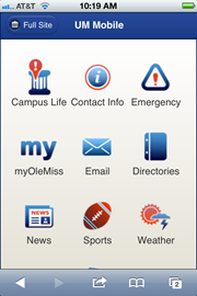
Figure 1. Campus website UM Mobile
Although having a mobile-friendly web presence was a good first step, we did not think we could stop there. We anticipated that our constituencies, especially students, would expect to be able to use mobile devices to interact with the university in all kinds of ways just as in other areas of their lives, e.g., banking, travel, and entertainment. This perspective was validated when we conducted a survey on mobility in September 2011 to better understand trends and expectations. There were slightly more than 1,700 respondents to the mobility survey. Among these were students (66 percent), employees (27 percent), alumni (11 percent), and others. We were surprised to find that 40 percent of the survey respondents reported that they currently used an iPad. Of the respondents who did not currently use an iPad, 32 percent reported that they intended to purchase one in the next year. More than half (54 percent) of all respondents reported that they expected to spend more time using a mobile device than a web browser in the future (figure 2).
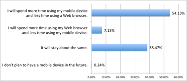
Figure 2. Anticipated relationship between web browser and mobile device use over time
Our initial aim was to identify and license a Mobile Enterprise Application Platform (MEAP) that would allow us to design and develop once and then deploy apps to multiple device types. We evaluated several options and came to the conclusion that the user interfaces resulting from this approach were not satisfactory. Also, we did not see enough savings in effort using a MEAP versus developing native code. Instead of investing in a MEAP, we licensed SAP's Netweaver Gateway product, which would let us expose data in our back-end SAP ERP system as representational state transfer (REST) web services using an open data (OData) protocol. This provided an easy, straightforward way to consume and act on SAP data from a variety of mobile devices. We intended to continue with the mobile-friendly web approach and add a few, very carefully selected native apps until the way became more clear. We did not completely abandon the idea of a MEAP but rather put it on hold until these products matured.
We implemented two native apps for internal university use — one for a Motorola hand-held computer to support the property control process and another for Apple's iPad to support regional admissions counselors (RAC) in their recruiting efforts. The RAC iPad app required a secure method for retrieving prospect and admissions information from our SAP ERP system. This was easily accomplished using SAP's Netweaver Gateway product. We also licensed Blackboard's Mobile Learn platform in response to numerous student requests.
SAP, Mercury Intermedia, and the iPad
During this exploratory phase, representatives from SAP demonstrated a prototype iPad app that SAP planned to use for communication with employees located around the world. While viewing the demo, a social media expert in UM's University Communications department whispered emphatically, "That is what we need!" Others agreed. We were extremely impressed with the attractive and user-friendly tablet interface and wanted to find out more. SAP told us about their partnership with Mercury Intermedia, the company that designed and developed SAP's internal news app. Located in Brentwood, Tennessee, the company is a world leader for mobile news app development, having built applications for USA Today, the New York Times, the Washington Post, CNN, Fox News, etc. SAP helped arrange a conference call and subsequent meeting with Mercury Intermedia's CEO, Bill Tallent.
Up until this point, we had focused on app concepts that were more functional than promotional. As a typical university IT organization, we had lots of experience in deploying software applications that acted on structured data, but we were less experienced when it came to rich media. Seeing products developed by Mercury and talking with their developers gave us a greater appreciation of the importance of the user interface in mobile applications and how people experience apps. Also, we began to see the potential of a tablet device for sharing news, high-definition photographs, videos, and other content with our constituencies. That is, we saw a path forward from print-based delivery of promotional materials to digital, extending far beyond our existing web presence.
The data collected in the mobility survey indicated a high rate of iPad ownership among students, employees, and alumni, making it the most logical choice for an initial deployment. The appeal and utility of the iPad across so many demographics further confirmed its value in a university setting. We thought we could justify the development effort and cost to build a native mobile app for the iPad where the device size and features could really make a difference in the user interface. Our insights about the iPad phenomenon were validated when Apple CEO Tim Cook announced that they had sold 55 million iPads in only 1 3/4 years versus 22 years for the Mac.2
It quickly became evident that a partnership with Mercury Intermedia would propel our mobility efforts forward by leveraging Mercury's deep and extensive expertise as well as its leadership position in the mobile news industry. Working with Mercury would provide a low-risk, relatively low-cost, and big-impact way to connect with our constituencies. It would also buy time as we continued to develop our overall mobility strategy. Thus, we embarked on a project with Mercury to develop a killer university news app for Apple's iPad.
The Genesis of the Official Ole Miss App
Our first step was to form a committee that included representation from IT, University Communications, Athletics, the Meek School of Journalism and New Media, the Student Media Center, Student Affairs, Alumni Affairs, Human Resources, and the Office of Research and Sponsored Programs. The committee conducted focus groups, brainstormed, and then made recommendations on what content the app should include and how the content should be generated and maintained. The focus groups revealed two types of information that people wanted but did not have good access to at the time — sports scores and campus events.
The next step was a face-to-face working meeting with Mercury Intermedia to discuss these ideas and begin the design process. Mercury responded by developing mock-ups and, in doing so, provided invaluable advice on how to streamline the content for an attractive and user-friendly mobile interface. Mercury's chief creative officer, Rusty Mitchell, helped us balance our academic tendencies toward detail and completeness with the need for a clean, simple interface suitable for a tablet device. According to Mitchell:
"Mercury adheres to a philosophy that Apple has followed for years. Design is not how something looks, but how it works. We obsess down to the pixel to ensure the apps we create are visually engaging, but our primary goal is to create an enjoyable experience where the interface of the application disappears."3
The App Design
The design includes five sections: Top News, Alumni & Friends, Athletics, Faculty & Staff, and Students. Included among the various features are news stories, photo and video galleries, Twitter feeds, announcements, blogs, events, scores, and weather reports (figure 3). Although not in the original project scope, we added a campus map and directory midway through the project given their high value in a university setting (figure 4). Both are delivered natively for the best user experience. The app even includes a feed from the local university radio station known as "Rebel Radio." Mercury designed the app to perform well in both landscape and portrait modes. Mercury also designed the app to take advantage of the newest iPad features such as Retina display, significantly enhancing the appearance of the app's photography. Lastly, Mercury designed the app so that it could be deployed for other universities with relative ease by changing the "skin," i.e., the branding.
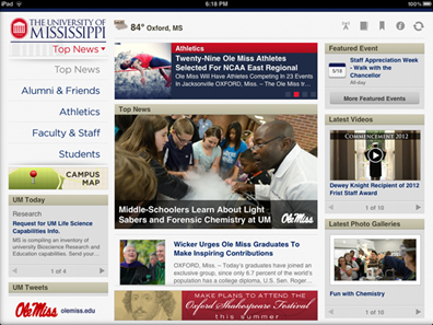
Figure 3. App screenshot in landscape mode
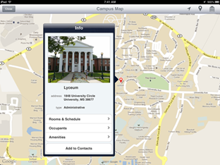
Figure 4. Screenshot of app map
With a strong background in ad-supported news, Mercury Intermedia included advertising inventory in the app. The first version of the app includes self-promotional advertisements ("house ads") only, but we have the capability to include commercial ads in the future to defray or even cover the cost of building and operating the app if we wish. The current advertisements promote UM schools and colleges and special events. We anticipate using external advertisements once the app becomes more established, but first we need to explore and resolve related policy issues. For example, the UM Student Media Center has expressed concern over losing revenue gained through student newspaper advertisements if the app supports external ads. Also, we want to maintain a classy, beautiful user interface without distractions and interference from competing content. For these reasons, we are proceeding very carefully with advertising.
Content as "Feeds"
The app consists of more than 40 separate multimedia feeds that are cached in Mercury's M3 system, software that serves over 40 billion stories and notifications to 45 million mobile devices worldwide. We had the choice of running M3 on a platform hosted by Mercury or hosting it ourselves. We chose to host the M3 platform in the university's data center using Cisco's virtualized Unified Computing System, although the prototype was developed on systems hosted by Mercury, which allowed the initial phases of the project to move forward quickly. Figure 5 shows the resulting M3 infrastructure hosted on UM's systems.
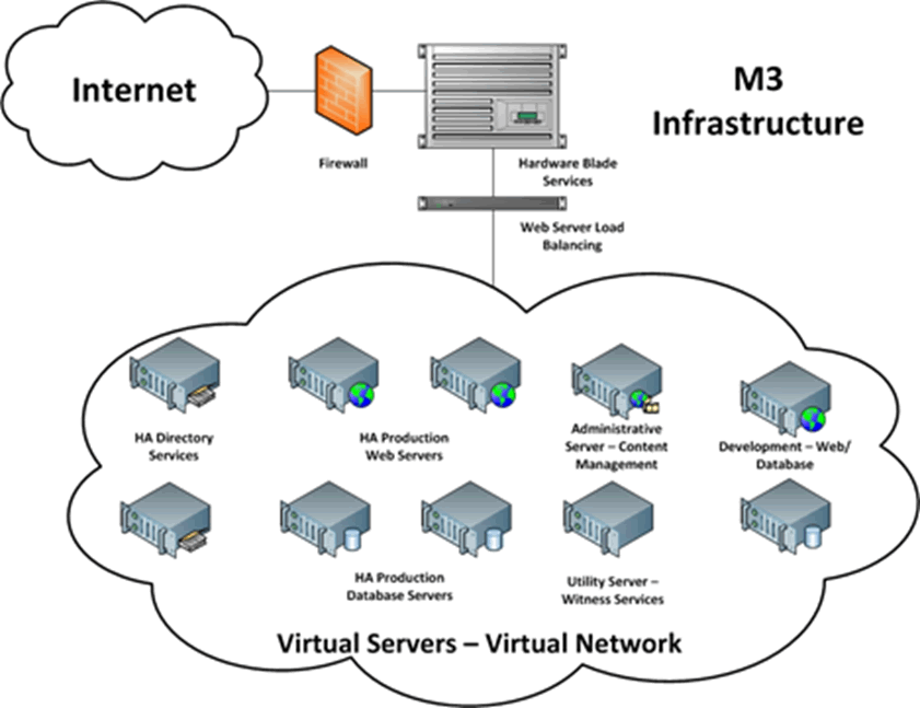
Figure 5. M3 infrastructure at Ole Miss
Although either approach can work well, we chose to self-host M3 for the following reasons:
- UM has strong data center management and systems administration expertise with low turnover among employees. With the basic infrastructure services in place, we can use new projects to further enhance our local infrastructure, expand our technical skill set, and learn about new technology management techniques.
- In our environment, one-time funds are easier to come by than ongoing funds, so we try to choose the route that minimizes the annual costs.
- And in our environment, we recycle hardware downwards, using it far beyond the original purpose, for example as a test platform for other projects.
About 60 people hours were required to set up the M3 infrastructure, with several hours per week monitoring the system thereafter, some of which would also be required in a cloud scenario. This does not include the effort to set up the feeds.
The M3 system is configured to poll the feeds at regular intervals, with the frequency of polling determined by the feed type. Individual devices running the app get content from the M3 system rather than from the feeds directly. (Figure 6 illustrates the M3 architecture with the media feeds.) This approach yields several important benefits. First and foremost, this architecture allows for deployments of future versions of the app on other mobile platforms. The bulk of the effort goes into setting up the feeds. Mercury has developed application programming interfaces (APIs) that give access to the feeds within M3 from the native programming environments of the major mobile platforms. Second, this architecture manages the load to the back-end data sources and allows for content even when specific feeds are offline. Third, this architecture provides a design framework that allows for constantly changing content.
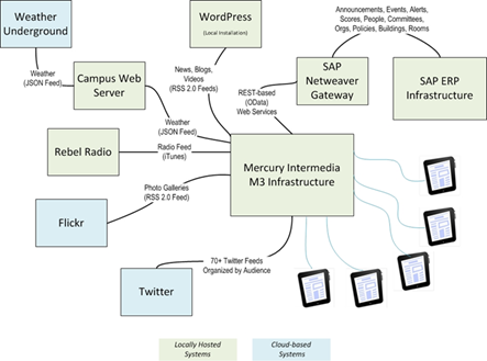
Figure 6. M3 architecture with media feeds
Most of the feeds are provided either through a local WordPress installation or from data in UM's SAP ERP system delivered as REST web services with Netweaver Gateway. As noted earlier, in planning for the app we identified two types of information as being difficult to find but of high value — scores and events. Progress in both areas would require parallel projects to improve the underlying management of this data. The remaining content existed but had to be evaluated and organized into media feeds for consumption by the app. This included news stories, photographs, videos, Twitter feeds, campus radio, buildings and amenities for the map, organizations and people for the directory, ads, alerts, and more. This approach employs a combination of on-premises and cloud-based services, licensed and open source, all of which are presented as unified content in the app.
IT and Athletics explored ways to enter and deliver scores, first focusing on generating feeds from existing interfaces for reporting scores. We abandoned this approach after finding that the commercial software for score reporting had inherent limitations, making modern retrieval methods difficult. Instead we built a web-based mobile app for entering scores from game sidelines and then storing these in customer tables within our SAP system. We already had all of our opponents in SAP as "external organizations," i.e., institutions from which we received transcripts as part of transfer articulation and equivalency determination. We simply added a new infotype to store team icon, name used in score displays, and a flag indicating whether this was an athletics opponent (figure 7).
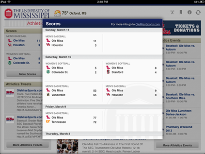
Figure 7. Score display with iPad app
To give better access to event data, IT worked with University Communications to redesign the campus calendar and enhance the underlying data model. We already had a good method for managing campus announcements using customer tables within UM's SAP system. We added new fields to store event time and location, as well as flags to indicate whether a ticket or registration was required, whether the event was open to the public, and whether this was an ongoing exhibit. We also added the capability to categorize events as student, alumni, athletics, or faculty/staff to allow for filtering depending on the placement within the app.
Going Live
The process of managing the Mercury Intermedia project to successful completion matched our experiences with other technology projects. UM employees tested the app and iteratively reported feedback to Mercury. Mercury maintained an issues list and gradually worked through these with incremental version releases prior to going live. Certain issues belonged to UM, such as how content was tagged within the feeds. Issues were categorized as "Must fix before launch," "Would be nice to fix prior to launch but not required," and "Not required for launch." The app was submitted to the Apple App Store on March 30, 2012 as the "Official Ole Miss App — iPad Edition," and it became publically available on April 9, 2012. Downloads are not restricted in any way. Prospective students, current students, parents, employees, alumni, fans, and even those who just want to find out more about Ole Miss or check out the app can freely download it from Apple's App Store by searching for "Official Ole Miss App."
Follow-Up Survey
We conducted an online survey to gather feedback and gauge reactions to the app during the first three weeks after the initial launch. There were 881 responses, split among students (38 percent), parents (24 percent), employees (10 percent), alumni (34 percent), Mississippi citizens (12 percent), and others. (Respondents were allowed to check more than one category.) As we suspected, of all the campus constituencies, iPad ownership was lowest among students at 35 percent. Alumni and employees showed the highest rate of iPad ownership at 59 percent, and iPad ownership among parents was 50 percent. Figure 8 shows the iPad ownership results.
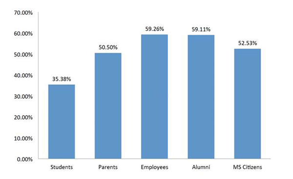
Figure 8. iPad ownership by audience type
Our September 2011 mobility survey showed that cost was the biggest barrier to iPad ownership, so it was not too surprising that students were the least likely to own an iPad. We were pleased to find that 60 percent strongly agreed and 36 percent agreed with the statement, "The Official Ole Miss App is an effective method for sharing news and connecting with students, employees, alumni, and fans" (figure 9). The most powerful result was that, for iPad owners, the Official Ole Miss App — iPad Edition moved into the No. 1 spot as the most frequently accessed method for getting information about Ole Miss, surpassing all other methods — the Ole Miss website, the Daily Mississippian, social media, printed publications, etc.
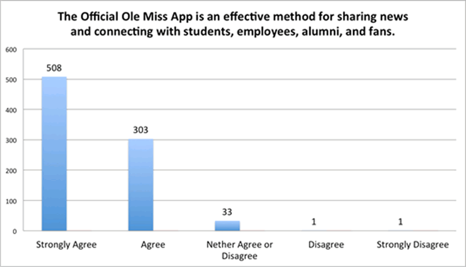
Figure 9. Overall effectiveness of the app
We asked three narrative questions about the app: "What do you like most about the app?"; "What do you like least about the app?"; and "What other features would you like to see added to the app?" The most frequent responses (summarized) to "What do you like most about the app?" were: (1) convenience and ease of use with a one-stop location for information about Ole Miss literally at your fingertips; (2) the beautiful design; and (3) the availability of the app on an iPad (figure 10). There were numerous positive comments, such as "Just an awesome opportunity to stay in touch with my university" and "I love being able to carry the news and information about Ole Miss around with me (instead of having to read it from a small Smartphone screen or wait until I am on a PC)." Several noted the vastly improved user experience in viewing news, photographs, and video from a tablet rather than a computer screen or television. Another frequent comment was that the app gave instant access to information. For example, photographs from baseball games are posted immediately afterwards, whereas it might take several days to see these same photographs in traditional print media. Not only are the photographs made available more quickly, but they are also of a much higher quality when delivered through the app. Overall, respondents noted that the app made them feel like they were on campus even though they were far away, i.e., they could visit Ole Miss "virtually" anytime.
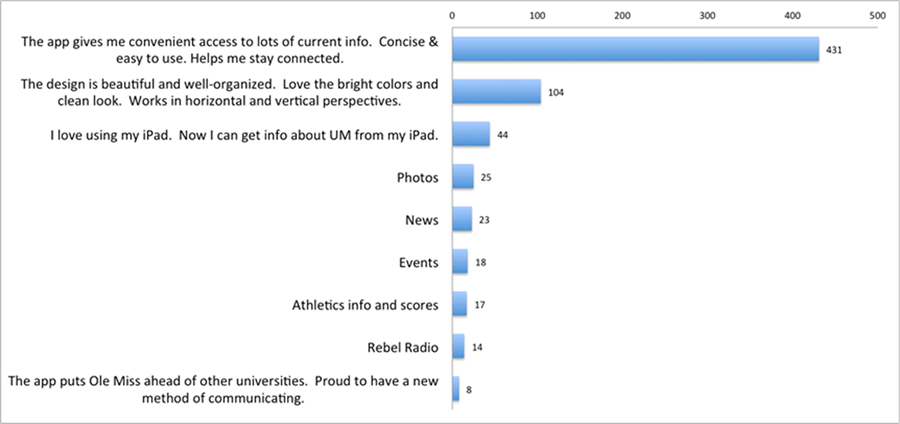
Figure 10. "What do you like most about the Official Ole Miss App?"
The most frequent responses (summarized) to "What do you like least about the app?" were that it is only available on the iPad, that it needs to support myOleMiss (the campus portal) functions, and that it has limited information and features (figure 11). Students, employees, and some parents expressed a desire to have productivity tools such as the ability to view grades and register for classes. Continuing this theme, the most frequently requested new feature was access to myOleMiss from the iPad. One of the most creative new features proposed was, "Geo-location so I can see other alumni near me (with their permission, of course)."
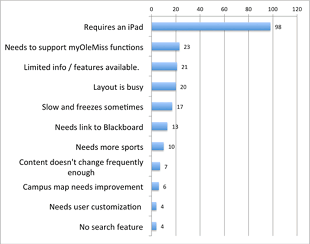
Figure 11. "What do you like least about the Official Ole Miss App?"
We also asked, "On which other platforms would you like to see the Official Ole Miss App deployed?" The iPhone won out handily at 55 percent, the Android phone was second at 17 percent, the Kindle Fire third at 11 percent, and the Android Tablet and Samsung Galaxy were tied at 7 percent (figure 12).
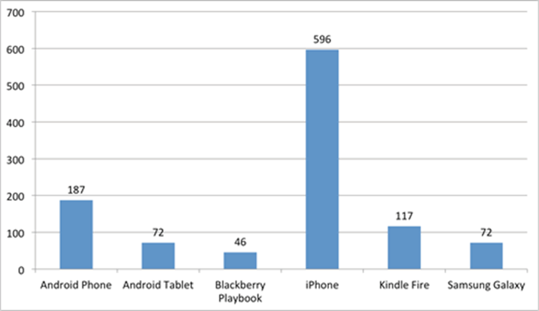
Figure 12. "On which other platforms would you like to see the Official Ole Miss App deployed?"
Benefits of a News App
We are experiencing anticipated and unanticipated benefits now that the news app is live. These mostly focus around recruitment, reputation, and relationships. With regard to recruitment, it is commonly stated internally that if we can get students on campus, then they will be sold on attending UM. This is in large part due to UM's beautiful campus, which regularly receives accolades; one of the most recent was being named No. 1 in Newsweek's 2011 "Most Beautiful" college ranking. We have a large out-of-state student population, and we seek to increase our international student population. These factors create a strong motivation for giving potential students and parents a way to experience our campus from afar. The Official Ole Miss App accomplishes this very effectively, i.e., it conveys the feeling of the campus, especially through the high-definition photography and videography.
As a member of the Southeastern Conference, UM receives a lot of media attention on athletics, including on multiple sports-related mobile apps, some endorsed by UM and some not. The Official Ole Miss App lets us present a more balanced view of the university, featuring not only athletics but also student and faculty achievement, outstanding academic programs, advances in research, and so on. The app helps form positive impressions about Ole Miss and this part of the country by showing the diversity in our community through current photographs and videos of student activities and campus events. Moreover, the app provides one more way to communicate the university's value to the public.
An unexpected benefit of the app is that it helps create a sense of community. Some of the most stunning photo galleries have been of outreach events showing people of all ages enjoying science and interacting with the environment. A specific example is an event sponsored by the UM Physics and Astronomy department inviting the public to view the Transit of Venus at the Kennon Observatory. Equally impressive are photographs from an Ecology Day Camp featuring children exploring insects of all kinds. A photo gallery from late April featured "The Big Event," during which several thousand UM students participated in volunteer community service. News and images from these events can be delivered instantly and with a higher resolution than those for our website because of the newest iPad's Retina display.
UM's Chief Communications Officer, Tom Eppes, said to me earlier this year, "In today's world, if you're ahead of the pack in technology, you're assumed to be a leader across the board."4 There has been a lot of discussion about the role of the CIO and IT in higher education, e.g., "plumber or strategist."5 Tom's observation — that the way an organization uses technology influences how people perceive the organization — is noteworthy, especially coming from someone with a nontechnical background who spent most of his career in the private sector. Accordingly, one more benefit of the app is that it positions UM out in front in the use of mobile technology and in a way that has broad exposure, further enhancing the university's reputation.
Beyond this, there is the very practical benefit of learning about and preparing for future modes of content delivery that meet the expectations of upcoming alumni. That is, how much longer will glossy publications be the primary way that universities reach alumni and other stakeholders? Given the cost of producing and delivering print-based materials, mobile devices — especially tablets — are a promising alternative.
Lessons Learned
Some of the most important lessons learned from this "adventure in mobility" follow:
- A beast you have to feed: These were the words of one of the follow-up survey respondents admonishing UM to provide thorough, current, rich content. This becomes even more of a challenge during summer months, when there is less activity on campus. For the app to succeed requires a commitment to providing frequent, high-quality content. The Twitter feeds in the app help by providing a flexible way for more voices to be heard. Even so, we think the app could benefit from more interaction and engagement with end users and are exploring options with Mercury. The bottom line is that fans are hungry for information about Ole Miss, and we have to find ways to meet this need.
- Departmental silos not allowed: To reach its potential, a university news app needs to be all-encompassing and should, therefore, involve all of the primary stakeholders. Likewise, for the investment of funds and effort to pay off, the app should have a campus-wide focus, which can also help with the issue of having sufficient high-quality content. In the decentralized environment of a typical university, IT can play an important role in coordinating the project and ensuring the appropriate people are at the table, as happened in this case.
- One super app vs. a set of related apps: We have had long discussions internally and with Mercury Intermedia on whether we should add functionality to this app or deploy dedicated apps that perform specific tasks or sets of tasks. Our current plan is to expand the Official Ole Miss App with a few tasks targeted toward each audience type, add references to other university-sponsored apps, and ensure that there are clear paths from the app back to the mobile-friendly website. For this approach to succeed, we will need new policies and guidelines that promote consistent branding and quality across UM's app portfolio.
- It's all about the user experience: Working with Mercury Intermedia has given us a much greater appreciation for the importance of the user experience in mobile applications, i.e., the "wow factor." We have become more aware of news websites that are cluttered, disorganized, and dominated by constantly interfering advertisements. We have come to appreciate elegant tablet features such as finger flicks and tapping to close pop-up windows. The follow-up survey indicated great pleasure in using the Official Ole Miss App simply because it was offered on the iPad. This is a topic worthy of further study: Why do some people strongly prefer reading news on the iPad than on a computer through a web browser?
- Cross-pollination is healthy: One of my favorite activities is attending SAP's annual TechEd conference, which draws technical professionals from across a great variety of industries. It is fascinating to hear how corporations, health care, and others in the public sector use technology to improve services and run better. Working with Mercury Intermedia on the Official Ole Miss App resulted in a similar synergy. By transferring successes from the commercial mobile news industry to a university environment, we delivered a unique and sophisticated app.
Conclusions and Next Steps
Reflecting back, we can identify several factors that contributed to the success of the project. These factors create a sense of "readiness," setting the stage for the adoption of new and transformative technologies.
First, UM's mature SAP infrastructure provided an easy way to address underlying data gaps — for example, scores and events — and to expose this data using modern methods. No new systems had to be deployed; we simply extended our existing SAP system with additional data and services.
Second, UM has a capable, motivated (although lean) IT staff and the confidence that comes from a long history of successful technology projects. We firmly believe that, in a large university environment, it is crucial to have a strong technical staff that can help drive innovation.
Third, UM enjoys a culture where members of the campus community, including the leadership team, embrace positive change.
Finally, we partnered with a recognized world leader in mobility to surge forward at a speed that would not have been possible on our own.
We are working now with Mercury Intermedia to address the comments and suggestions from the follow-up survey. The top priority is to offer the app on other platforms. Accordingly, Mercury is proceeding with a version of the app for the iPhone. As noted, all of the effort that went into setting up the M3 infrastructure and feeds will be reused when the app is deployed to other platforms due to there being an API for each major platform to access content in M3.
The next version of the iPad app will include a native map and directory, assorted user interface improvements, and a small set of task-oriented functions targeting the various audience types. We are scoping out more functionality for our mobile-friendly website as well as future apps to accomplish specific tasks, such as an attendance app that interacts with our back-end SAP system. For now, we are very pleased with the first deployment of the Official Ole Miss App and look to a bright future, including more adventures in mobility, aided by our vendor partners.
Getting the App
To download the app, search for "Official Ole Miss App" in Apple's App Store. For more information or to download the app directly, visit olemiss.edu/ipad.
Acknowledgment
Special thanks go to Robin Miller, Deputy CIO, for his contributions dealing with the M3 infrastructure.
- This value does not include the University of Mississippi Medical Center located in Jackson, MS.
- Philip Elmer-DeWitt, "Transcript: Apple CEO Tim Cook at Goldman Sachs," February 5, 2012, CNN Money.
- Personal communication March 14, 2012.
- Personal communication March 17, 2012.
- Bradley Wheeler and Brian D. Voss, "The CIO: Plumber or Strategist," October 14, 2010, EDUCAUSE 2010 Annual Conference.
© 2012 Kathryn F. Gates. The text of this EDUCAUSE Review Online article (July 2012) is licensed under the Creative Commons Attribution-Noncommercial-No derivative works 3.0 license.
